About ePub and eBook Help

I help people convert their books into .ePub and .mobi Amazon Kindle masterpieces that sell well. I assist with all aspects of self-publishing on Amazon Kindle. I myself have successfully self-published a number of my own books that have sold well as Amazon Kindle eBooks and also as Print-On-Demand hardcopies on Amazon.

A High Tech Way To Make Your eBook Go Viral

Any good salesperson will tell you that the very best time to get an enthusiastic customer recommendation is immediately after a customer has just had a great experience with your product.

If you could provide your reader with a way to send a personal recommendation directly to a friend along with a link to your ebook’s Amazon sales page while your customer has just finished your ebook and is still holding the e-reader is his or her hand, would you do it?  Who wouldn’t want to do that?

Here is one very effective way to do just that. In summary, the technique is as follows.

The e-reader needs to have connectivity with the Internet for this to work. Your ebook will provide a hyperlink to a web page on one of your web sites.

When customer clicks on the hyperlink and the web page opens up in the e-reader, the customer simply types in a personal message along with friend’s email address into a form on that web page and then hits “Send.” That’s it. An email is then sent immediately to the friend with the message and a link to the ebook’s Amazon sales page.

The web page is created with PHP and I will provide the code. PHP sends the email directly from the server that hosts the web page. Nothing happens on your customer’s computer or e-reader. No email functionality is needed on your customer’s end, just Internet connectivity.

Before I get into the details and the code behind all this, let me show you what it looks like. I have written several children’s educational books that do some interactive stuff using KF8. Here is what a reader of one of these books would see and experience when going through this process.

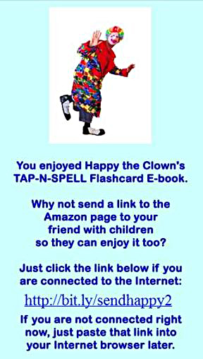
First, the customer would arrive at a page in the ebook that contains a link to the web page on my site. Below is a page in one my kids’ books that does that (Yes, that’s me in a clown suit).

Email-to-a-Friend_eBook_Page

Email-to-a-Friend_eBook_Page

If the e-reader is connected to the Internet, the hyperlink shown on this ebook page, http://bit.ly/sendhappy2 , links to the following page on my web site that is shown below.

It is always a good idea to shorten your URLs with a URL shortening service like bit.ly as I am doing here. If your customer’s e-reader is not connected to the Internet, your customer will have a much easier time remembering the shortened URL than the actual URL.

If you click on that link in the ebook, you will be taken to the web page below.

Here is the top half of the landing web page on my web site and directly below is the bottom half of the web page:

Send-To-A-Friend Web Page On My Site

Send-To-A-Friend Web Page On My Site

I will provide the code to create this web page with PHP shortly.

You can fill out the form as shown below and hit “Send.”

Filled-In Send-To-A-Friend Form

Filled-In Send-To-A-Friend Form

This page is written with PHP (I’ll present the code). Hitting the send button activates the php email function located at the server hosting my site. No email functionality is required on the customer’s end. Everything is done from the server hosting this web page.

Hitting the “Send” button will send an email message to the email address: mark@epubandebookhelp.com that appears to come from this sender:

DonaldDuck@Disney.com

with the following Subject Line:

Donald Duck Sends a Link About an eBook Your Child Will Like

Open up the email and the body of the email will be a text message as follows:

Your friend Donald Duck recommends this eBook – Happy’s the Clown’s TAP-N-SPELL 145 Fun Animals Flashcard eBook:

http://www.amazon.com/TAP-N-SPELL-Kids-Reading-Fun-ebook/dp/B008NWZFJ8/

Donald Duck thought you and your child might really enjoy it.

Donald Duck also had this to say about this fun and educational ebook:

“Hi Mark, Your son or daughter will really like this fun ebook. It\’s full of great jokes and very educational! Cheers, Donald Duck”

There it is.  The friend can just click on the link right from the email and be sent directly to the Amazon sales page for the book.

Here is the code for the web page. This page uses PHP version 5.5. The coding language PHP is more difficult to master than HTML. If you wish to create a web page like this and you are not strong with PHP, you’ll need to find someone who is.

I’ve removed all PHP security measures from the code below to keep it simple.

<!DOCTYPE html PUBLIC “-//W3C//DTD XHTML 1.0 Transitional//EN” “http://www.w3.org/TR/xhtml1/DTD/xhtml1-transitional.dtd”&gt;
<html xmlns=”http://www.w3.org/1999/xhtml”&gt;
<head>
<meta content=”text/html; charset=utf-8″ http-equiv=”Content-Type” />
<title>Send a Link To a Friend</title>
<link href=”../CSS_Style_Sheets/excel_book.css” rel=”stylesheet” type=”text/css” />
</head>
<body style=”background-color: #000080″>
<div align=”center”>
<p></p>
<div>
<div style=”background-color: #FFFFFF;      border: medium solid #FF0000; padding: 10px; margin: 10px; width: 500px”>
<?php  #  Script email.php
//          Check for form submission
if (isset($_POST[‘submitted’]))
{          //          Minimal form validation
if (!empty($_POST[‘name’]) &&
!empty($_POST[’email’]) &&
!empty($_POST[‘youremail’]) &&
!empty($_POST[‘comments’]) )
{          //          Create the body
$name = $_POST[‘name’];
$comments = $_POST[‘comments’];
$subject = “{$name} Sends a Link About an eBook Your Child Will Like”;
$body = “Your friend {$name} recommends this eBook – Happy’s the Clown’s TAP-N-SPELL 145 Fun Animals Flashcard eBook:\n\n http://www.amazon.com/TAP-N-SPELL-Kids-Reading-Fun-ebook/dp/B008NWZFJ8/ \n\n{$_POST[‘name’]} thought you and your child might really enjoy it.\n\n{$name} also had this to say about this fun and educational ebook:\n\n\”{$comments}\””;
//          Limit length to 200 characters
$body = wordwrap($body, 200);
//          Send the email
$email2 = $_POST[’email’] ;
$youremail = $_POST[‘youremail’] ;
mail($email2,
$subject, $body,
“From: {$youremail}”);
//          Print a message
echo ‘<p></p><p><em><strong><span style=”background-color:#FFFF00″>Thank you for emailing the link to your friend.<br />
Your friend and child will really appreciate it.</span></strong></em><br /><br/>
f you would like to send this link to another friend, go right ahead below.<br/><br />
</p>’;
//          Clear $_POST so that the form is not sticky
$_POST = array();
}
else
{
echo ‘<p style=”font-weight: bold;
color:#C00″>Please fill out the
form completely.<br />
Sorry but something was missing.</p>’;
}
}          //          End of main isset() IF
//          Create the HTML form
?>
<p>
<img alt=”Happy the Clown’s TAP-N-SPELL Flashcard eBook” height=”200″ longdesc=”Happy the Clown’s TAP-N-SPELL Flashcard eBook”
src=”../Images/Email_Pages/Clown_5_Bending_Right_White_Background_149_200.jpg” width=”149″ /></p>
<p style=”color:blue; font-size:x-large” > You enjoyed Happy the Clown’s<br />TAP-N-SPELL Flashcard E-book.<br />
Why not send a link to the Amazon page to your<br />
friend with children so they can enjoy it too?<br />
<br />Send the link right from here:</p>
<p style=”font-family:arial” ><strong>Fill In Your Name, Your Friend’s Email Address and Yours,<br />
Add a Comment, and Send the Link.<br />Your Friend Will<br />
Really Appreciate It.</strong></p>
<form action=”” method=”post”>
<p>Your Name:<br />
<input type=”text” name=”name” size=”30″
maxlength=”60″ value=”<?php if (isset($_POST[‘name’]))
echo $_POST[‘name’]; ?>” />
</p>
<p>Your Friend’s Email Address:<br />
<input type=”text” name=”email” size=”30″
maxlength=”60″ value=”<?php if (isset($_POST[’email’]))
echo $_POST[’email’]; ?>” />
</p>
<p>Your Email Address:<br />
<input type=”text” name=”youremail” size=”30″
maxlength=”60″ value=”<?php if (isset($_POST[‘youremail’]))
echo $_POST[‘youremail’]; ?>” />
</p>
<p style=”color: navy; font-size: 1em; font-weight: bold; text-align: center; font-style: italic”>We respect your email privacy.</p>
<p>Your Comments:<br />
<textarea name=”comments” rows=”5″
cols=”30″><?php if (isset($_POST[‘comments’]))
echo $_POST[‘comments’]; ?>
</textarea>
</p>
<p>
<input type=”submit” name=”submit” value=”Send!” />
</p>
<p>
<input type=”hidden” name=”submitted” value=”TRUE” />
</p>
</form>
</div>
</div>
</body>
</html>

I definitely recommend using bit.ly–shortened links whenever possible. In addition to being easier to remember if a person needs to go somewhere else to use the Internet, bit.ly also tracks how many people have clicked on the shortened link so you’ll know very quickly if you’re getting a lot of click-throughs.

The above adds just one extra page to your ebook, but what a worthwhile page !

How To Expand Text in Speech Bubbles With KF8

Most comic book and illustrated childrens’ book creators write for a relatively large printed page and not for the hand-held screen. Small details and text that are easily visible on 7×10 or 8.5×11 inch paper can shrink beyond recognition on the 600×1024 px screen of a hand-held Kindle device such as the Fire. Comic book and childrens’ book creators are some of today’s most incredible artists. Many of these talented graphic novel illustrators draw their works on 17 x 11 inch paper. Lots of childrens’ book illustrators actually paint on big canvasses and then take pictures.

Instead of redrawing the entire book for the small screen, there are several great alternatives that make it possible for a Kindle viewer to expand parts of an image such as speech bubbles by just tapping on them.

These techniques utilize Kindle’s new KF8 formatting. They work on all hand-held Kindles and also on Kindle for PC. They are as follows:

1)      Panel magnification – A viewer taps on a single panel of a multi-panel image. That panel expands and the rest of the image is greyed out. This technique is known as panel magnification with a lightbox. My most recent blog article covers in detail how to create the KF8 code for this effect. Here is a link to that article:

http://blog.epubandebookhelp.com/2012/05/16/kf8-panel-magnification/

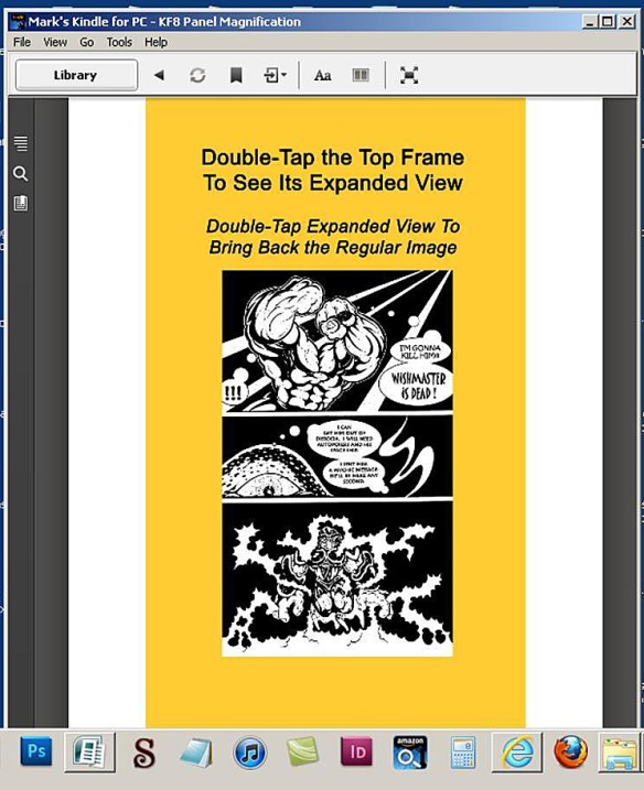
Here is how KF8 panel magnification with a lightbox looks in action:

KF8 Panel Magnification Before Before Activation

KF8 Panel Magnification Before Before Activation

To expand the top frame, click on it and here is the result:

KF8 Panel Magnification After Activation

KF8 Panel Magnification After Activation

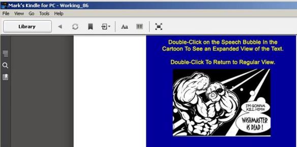
2)      Covering a speech bubble with a larger, filled frame containing expanded text – The speech bubble is still there, but is no longer visible because larger text inside a filled border is been placed on top of it. The viewer simply taps on the speech bubble to activate the visibility of thelarger text, which was invisible until then. This blog article will show how to write the KF8 code to create this effect, which is shown as follows:

KF8 Speech Bubble Text Expansion Before Activation

KF8 Speech Bubble Text Expansion Before Activation

Just tap on the speech bubble and the following text surrounded by a filled border appears on top of the speech bubble and covers it up completely:

KF8 Speech Bubble Text Expansion After Activation

KF8 Speech Bubble Text Expansion After Activation

3)      Swapping text with different text – This effect enables a viewer to tap on a screen and swap one set of text with a new set of text that can have totally different formatting and screen position.  This KF8 effect makes the initial text invisible and makes the new text visible. This blog article will also show how to write the KF8 code to achieve this effect, which is shown below:

KF8 Text Swapping Before Activation

KF8 Text Swapping Before Activation

A quick tap on “This is the original text” produces the following result:

KF8 Text Swapping After Activation

KF8 Text Swapping After Activation

This blog article will show in detail how to write the code for KF8 effects numbers 2 and 3 above.


General Explanation of Replacing Speech Bubbles or Text With Larger Text

1)      A Tap Target is created. The Tap Target is a region on the viewing screen that the viewer taps (in hand-held Kindles) or clicks (in Kindle for PC) to activate the text swap. The Tap Target is a <div> container that either provides the location of the speech bubble within the image or actually contains the initial text that will be swapped out.

2)      A Parent Container is created. The Parent Container is also a <div> container that holds the text that will cover up the contents of the Tap Target, whether that is a speech bubble or just regular text. The Parent Container is configured to be invisible because its CSS attribute “display” is set to “none.” The KF8 effect makes the Parent Container and its contents visible. This effect either covers up what was under the Tap Target (in the case of a speech bubble) or replaces the contents of the Tap Target <div> container (in the case of a text swap).

3)      Next we use KindleGen to convert the .epub file to .mobi. KindleGen has to be used to create any .mobi file that employs KF8 formatting. KindleGen can be downloaded from Amazon and currently runs only from the command prompt on your computer.

4)      Finally we are ready to view the .mobi file in a real Kindle e-reader. The Kindle Previewer isn’t capable of performing KF8 effects such as panel magnification or text swapping. You’ll need to load the .mobi file on an actual Kindle e-reader such as Kindle for PC or the Kindle Fire to view the KF8 effects in action. A regular ol’ Kindle will work just fine as well.

To load the .mobi file on your Kindle For PC, just paste the .mobi file into your My Kindle Content directory, which will be located in your My Documents directory. The My Kindle Contents directory is created when Kindle for PC is installed on your PC. When you open up Kindle For PC, you’ll see the new .mobi file sitting on the bookshelf.

To load the .mobi file into a Kindle hand-held device such as a Fire, connect the device to your computer with a USB cable. The Kindle will appear as another directory in your computer. Paste the new .mobi file into the Books directory of this Kindle device. When you go back into your Kindle, you’ll find the new .mobi file sitting on the bookshelf of the Docs directory, not the Books directory.

5)      Once the viewer has opened up the .mobi file in their Kindle, the viewer can click (in Kindle for PC) or tap (in a hand-held Kindle) on the Tap Target to activate the swap. The KF8 coding that will be shown here controls that swap. The contents of the Parent Container are made visible and brought to the top. The contents of the Parent Container either cover up what is under the Tap Target (in the case of a speech bubble) or replace what was in the Tap Target (in the case of swapping text).

******************************************************************

Before I present the HTML and CSS for this effect, let me provide some tips to make it easy to edit an .epub file. Keep in mind that you do all of the editing to an .epub file. The very last step is to convert the .epub file to a .mobi file and then load it into the Kindle e-reader. You never do any editing directly to a .mobi file.

I usually start building my .epub files from scratch by opening up a brand-new blank .epub file in the free epub editor Sigil. First I create and name all of the blank HTML and CSS pages that I’ll be pasting content into.

In this case, it only necessary to create a single, blank HTML page in the Text directory and name it SwapText.xhtml and a single, blank CSS page named SwapText.css in the Styles directory. The Text and Styles directories are default directories that appear in a new, blank epub file created in Sigil.

Following that, while you still have Sigil open, insert the 600×1024 image shown below into the default Images directory of the brand-new .epub file. This image should be named TextSwap.jpg.

TextSwap.jpg - Drawn By Fantastic Comic Book Artist Kris Aquino in His Comic Book Series "Dimensions" That I'm Preparing For Upload To Amazon Kindle At The Time Of This Writing

TextSwap.jpg – Drawn By Fantastic Comic Book Artist Kris Aquino in His Comic Book Series “Dimensions” That I’m Preparing For Upload To Amazon Kindle At The Time Of This Writing

I then add some basic meta data such as author name and book title to the file while it is still open in Sigil. I now save the file and close Sigil. Sigil will save the file as an .epub file. The filename that you save this .epub file will not be the ebook’s name when you see it on the book shelf of your Kindle e-reader. The ebook’s name as it will appear when on the book shelf is set as a meta tag in the .epub’s content.opf file. You can directly edit the content.opf file as explained later or simply use Sigil’s Meta Tools to set this title along with the author’s name.

You’ll want to do all of your editing to this .epub file using a free text-editing program such as Notepad++, or something similar which has numbered lines and search/replace functions. If you have a Mac, you’ll want to  use a free program called TextWrangler instead of Notepad++. Don’t use Windows Notepad as it doesn’t have the numbered-lines feature. Some of the files you’ll be editing here will looks like a dog’s breakfast if you open them up in Windows Notepad.

I recommend using Notepad++  and not Sigil to edit the HTML, especially in this case. I noticed that Sigil would do funny things to the JSON object (discussed below) that I had to undo every time I opened the .epub file up in Sigil. This didn’t happen with Notepad++.

I can now work the epub’s component files directly by changing the .epub extension to .zip and then opening this .zip file with WinZip. Once you have unzipped the .zip file,  use the free text editor Notepad++ to edit all of the component files inside the .zip file from here on out.

Now we’re ready to edit.

With that, let’s get right into it. I’ve placed both effects on the same page of the .epub/.mobi file so that all of the HTML and all of the CSS for both effects will be seen on a single .xhtml page and a single .css page. Initially I will present all of that HTML and all of that CSS for both effects.

I will then separate the effects and show how the HTML and CSS interact to create each of the two effects individually.

I will also show what lines of code have to be added to the .epub’s content.opf file to enable KF8 effects on your Kindle devices.

First, let’s start with the combined HTML for both effects. Here it is:

<?xml version=”1.0″ encoding=”utf-8″ standalone=”no”?><!DOCTYPE html PUBLIC “-//W3C//DTD XHTML 1.1//EN”  “http://www.w3.org/TR/xhtml11/DTD/xhtml11.dtd”&gt; 

<html xmlns=”http://www.w3.org/1999/xhtml”&gt;
<head>
<title></title>
<link href=”../Styles/SwapText.css” rel=”stylesheet” type=”text/css” />
</head>

<body> 

<!—Configuring overall screen and image size for both KF8 effects –>
<!– Defines page size (600 X 1024) and contains everything –> 
<div class=”fillScreen”>
   

<!– Defines image size (600 X 1024) and positioning – absolute –>

<div><img alt=””
class=”image”
src=”../Images/Text_Swap.jpg” />
</div>          

<!—Effect A – Replacing a Speech Bubble In An Image With Larger Text –>           

<!– Creates the Tap Target –>
<div id=”tapTarget_A”> 

<!—The JSON object that controls panel magnification –>  
<a class=”app-amzn-magnify”
data-app-amzn-magnify=
‘{“targetId”:”parentContainerPosition_A“, “ordinal”:1}’>
</a>   

</div>           

<!– Here is bordered container with new text –>
<div id=”parentContainerPosition_A
class=”parentContainerBorder_A“>
<p class=”finalTextFormatting_A”>
I’m Gonna Kill Him! WISHMASTER IS DEAD!!
</p>

</div>
          

<!—Effect B – Replacing Text With Different Text –>                        

<!—The original text to be replaced is contained within the Tap Target –>               

<!– Creates the Tap Target –>
<div class=”tapTarget_B”>

<!—The JSON object that controls panel magnification –>
<a class=”app-amzn-magnify”
d
ata-app-amzn-magnify=
‘{“targetId”:”parentContainerPosition_B“,
“ordinal”:2}’>

<p class=”tapTargetFormatting_B”>
This is the original text
</p>
</a>
</div>              

<!—The Parent Container contains the replacement text –>
<div id=”parentContainerPosition_B” class=”targetMagnifier_B”>
<p class=”finalTextFormatting_B”>
And here is the replacement text
</p>
</div>
</div>
</body>
</html>


Now here is the combined CSS for both effects:

/* This first section of the stylesheet is called a CSS Reset.  */
/* A CSS Reset removes inconsistent formatting that browsers often apply  */

html{color:#000;background:#FFF;}body,div,dl,dt,dd,ul,ol,li,h1,h2,h3,h4,h5,h6,pre,code,form,fieldset,legend,input,textarea,p,blockquote,th,td{margin:0;padding:0;}table{border-collapse:collapse;border-spacing:0;}fieldset,img{border:0;}address,caption,cite,code,dfn,em,strong,th,var{font-style:normal;font-weight:normal;}li{list-style:none;}caption,th{text-align:left;}h1,h2,h3,h4,h5,h6{font-size:100%;font-weight:normal;}q:before,q:after{content:”;}abbr,acronym{border:0;font-variant:normal;}sup{vertical-align:text-top;}sub{vertical-align:text-bottom;}input,textarea,select{font-family:inherit;font-size:inherit;font-weight:inherit;}input,textarea,select{*font-size:100%;}legend{color:#000;}

/* This section configures the whole screen and the image that will be used for both effects.  */

div.fillScreen {
height: 1024px;
width: 600px;
position: relative;
}

div.fillScreen div {
position: absolute;
}

div.fillScreen a {
display: block;
width : 100%;
height: 100%;
}

.image {
position: absolute;
height: 1024px;
width: 600px;
}
/* Effect A – This section replaces a speech bubble with text that is surrounded by a border and solid background */ 

#tapTarget_A {
top: 21%;
left: 60%;
height: 20%;
width: 25%;
}

#parentContainerPosition_A {
top: 20%;
left: 25%;
width: 70%;
}

div.parentContainerBorder_A {
position: absolute;
display: none;
font-size: 150%;
font-weight: bold;
padding: 10px;
border: 7px solid red;
background-color: yellow;
}

p.finalTextFormatting_A {
text-align: left;
color: blue;
font-family: “Times”;
}
/* Effect B – This section swaps text with different text that is formatted differently. */

.tapTarget_B {
position: absolute;
top: 65%;
left: 15%;
}

p.tapTargetFormatting_B {
text-align: left;
font-family: “Times”;
}

p {
margin: 0%;
padding: 0%;
color: white;
font-size: 2em;
}

#parentContainerPosition_B {
top: 60%;
left: 15%;
width: 85%;
}

div.targetMagnifier_B {
position: absolute;
display: none;
font-size: 125%;
}

p.finalTextFormatting_B {
text-align: left;
color: yellow;
font-weight: bold;
font-family: “Arial”;
}

**************************************************************

And that’s it for the CSS.

Before I go through each section of HTML and show how it interacts with the CSS to produce the text swap effect. we’ll add the following lines of code to the content.opf file. This code must be added to the content.opf file to enable KF8 functionality in Kindle devices.

Once again, to edit the content.opf file, change the .epub extension to .zip and open the file in WinZip. Open up the individual files inside the zipped file using Notepad++ and then do your editing. When you finish editing, change the .zip extension back to .epub.

Below are the lines that should be added to the meta data section of the .epub’s content.opf file in order to enable KF8 effects:

<meta name=”fixed-layout” content=”true”/>
<meta name=”orientation-lock” content=”none”/>
<meta name=”RegionMagnification” content=”true”/>
<meta name=”original-resolution” content=”600×1024″/>
<meta name=”zero-gutter” content=”true”/>
<meta name=”zero-margin” content=”true”/>

Here is what each of the above lines added to the content.opf file do:

<meta name=”fixed-layout” content=”true”/>
The above tag that tells the Kindle e-reader to use fixed-layout properties.

<meta name=”orientation-lock” content=”none”/>
This tag can be set to the following choices: portrait-only/landscape-only/none. You might pick portrait-only, for example if you wanted your file viewable only  as portrait in smaller devices such handhelds. That is not the case here. If you are viewing this file on a Kindle Fire, it will be viewable in both portrait (if you’re holding the Kindle Fire upright) or in landscape (if you’re holding the Kindle Fire sideways).

<meta name=”RegionMagnification” content=”true”/>
The above line enables panel magnification in KF8.

<meta name=”original-resolution” content=”600×1024″/>
This identifies the original display size that the content was designed for. This content was originally designed to function in a Kindle Fire, which has a screen size of 600×1024 px.

<meta name=”zero-gutter” content=”true”/>
<meta name=”zero-margin” content=”true”/>

These allow the whole screen to be filled out.

Amazon also states that one of the following book-types should be added to the meta-data section of the content.opf file:

<meta name=”book-type” content=”children”/>
<meta name=”book-type” content=”comic”/>

This is an optional entry. You should leave it out.  Text swapping will function perfectly without it.  Including a book-type value will disable some of the live-text functions in a fixed-layout KF8 ebook, such as bookmarks, highlights and annotations, full search, and dictionary. Background image pinch-and-zoom using double-tap won’t work if the “comic” book-type is selected.

I don’t know of any reason to include a book-type value in the meta-data section of the content.opf file. Amazon’s documentation doesn’t currently list any reason either.

Here is one more useful tip regarding the content.opf file: When you create a new .epub, one of the first things you should do is to update the title in the meta-data section of the content.opf file. The Kindle reader will show the title of a .mobi file that listed in the content.opf file, the name of the .mobi file that you have saved it as. If you forget to update the title in the content.opf file when you create a  new file (especially if you created the new .epub by copying and existing .epub file), you might open up your Kindle device and find that  two .mobi files sitting on the bookshelf have the same name.

And finally, here is how the HTML interacts with the CSS to create the text swap effects shown above.

*****************************************************************

<!—Effect A – Swapping a Speech Bubble In An Image With Larger Text –>
<!– Creates the Tap Target –>   
<div id=”tapTarget_A”> 

#tapTarget_A {
top: 21%;
left: 60%;
height: 20%;
width: 25%;
}

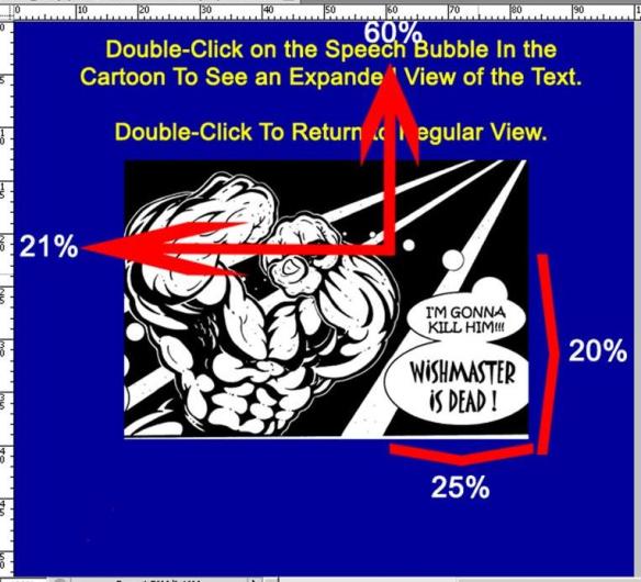
This CSS code indicates that the Tap Target starts on the screen with its upper left corner 21% of the screen’s height down from the top and 60% of the screen’s width from the left. The height of the rectangular Tap Target takes up 20% of the screen’s height. The Tap Target’s width takes up 25% of the screen’s width.

These dimensions can be determined by dropping the image into Photoshop and viewing the measurement ruler that will appear on the image’s edges.

When the image is opened up in Photoshop, enable the Rulers (View / Rulers) and set the Ruler to show increments of height and width as percents of the image’s height and width  (Edit / Preferences / Units & Rulers / Rulers : Percent).

A screen shot of this Photoshop work is shown below. It doesn’t matter how large or small you’ve sized the image before opening it in Photoshop. The height and width will always measure 100%. You simply have to figure out where you want your Tap Target to be in the image and where the image’s edges line up on the percent rulers. Do it as follows:

Using Photoshop To Determine the Tap Target Position

Using Photoshop To Determine the Tap Target Position

*****************************************************************

Below we create the JSON object that controls the text/speech bubble swap 

<!—The JSON object that controls the text/speech bubble swap –> 
<a class=”app-amzon-magnify” data-app-amzn-magnify=
‘{“targetId”:”parentContainerPosition_A“, “ordinal”:1}’>
</a>   

</div>

Inside this div container is a JSON object, shown once again below:

<a class=”app-amzon-magnify”
data-app-amzn-magnify= ‘{“targetId”:” parentContainerPosition_A “,
“ordinal”:1}’>

</a>

A JSON (JavaScript Object Notation) object is a convention used to transfer collections of name/value pairs. This JSON element app-amzn-magnify is specific to Amazon products and is not listed anywhere else in CSS. It controls the text swapping process.

Here is what each part of the JSON element does:

<a class=”app-amzon-magnify”  This anchor contains the JSON element which controls the text swapping process)

“targetId”:” parentContainerPosition_A ”  This identifies the region that will be expanded. This must match the id of the parent container for the replacement text, window, and the larger image. This parent container label appears in the next line of HTML code after the JSON object as follows:

<div id=”parentContainerPosition_A” class=”parentContainerBorder_A”>

“ordinal”:1 The ordinal states the order that the JSON object will appear on the page. There is only one JSON object on this page so the ordinal = 1. The next KF8 effect on this page will have the ordinal set to  2.

“SourceId”  This is a tag that is listed in Amazon’s Kindle Publishing Manual but is not needed for this effect.

The CSS id #parentContainerPosition_A also provides the location of the replacement text that will cover the speech bubble. The upper-left corner of this text will start 20% down from the top, 25% from the left of the screen, and extend 70% of the width of the screen.

#parentContainerPosition_A {
top: 20%;
left: 25%;
width: 70%;
}

The speech bubble is completed covered because the text is enclosed within a large border that contains a solid background. The border’s size is larger than the speech bubble and therefore completely covers up the speech bubble. The div class parentContainerBorder_A configures the border and background.

Everything within this <div> container is invisible because the div’s CSS display attribute is set to “none.” Everything within this <div> container will be invisible until the KF8 effect is activated by a click or tap on the Tap Target. The KF8 effect sets the contents of this <div> container to be visible and on the top layer.

div.parentContainerBorder_A {
position: absolute;
display: none;
            font-size: 150%;
font-weight: bold;
padding: 10px;
border: 7px solid red;
background-color: yellow;
}

***********************************************************************

This HTML creates the Parent Container, which contains the replacement text, the text’s formatting, the border, and the solid background. All of these will cover up the speech bubble when they are set to be visible and on the top layer.           

<!– Here is bordered container with new text –>
<div id=”parentContainerPosition_A”
class=”parentContainerBorder_A“>
<p>
I’m Gonna Kill Him! WISHMASTER IS DEAD!!
</p>
</div>

The CSS id #parentContainerPosition_A provides the location of the replacement text that will cover the speech bubble. The upper-left corner of this text will start 20% down from the top, 25% from the left of the screen, and extend 70% of the width of the screen.

#parentContainerPosition_A {
top: 20%;
left: 25%;
width: 70%;
}

The speech bubble is completely covered because the text is enclosed within a border that has a solid background. The div class parentContainerBorder_A configures this border and background. Its CSS display attribute is set to “none” so that anything in this <div> container will not be visible until the KF8 effect is activated.

div.parentContainerBorder_A {
position: absolute;
display: none;
            font-size: 150%;
font-weight: bold;
padding: 10px;
border: 7px solid red;
background-color: yellow;
}

The replacement text formatted by the following CSS:

p.finalTextFormatting_A {
text-align: left;
color: blue;
font-family: “Times”;
}

The above style is the inner-most CSS style and will therefore over-ride all other CSS parent styles that are applied to it.

***********************************************************************

<!—Effect B – Replacing Text With Other Text That Can Be Formatted and Positioned Differently –>                                

<!– Here is original text to be replaced –>
<!– Creates the Tap Target –>
<div class=”tapTarget_B”>

The location of the Tap Target is configured by the following CSS:  

.tapTarget_B {
position: absolute;
top: 65%;
left: 15%;
}

This states that the Tap Target has its upper left corner 65% down the screen from the top and 15% of the screen from the left.

Using Photoshop To Determine the Location of the Tap Target

Using Photoshop To Determine the Location of the Tap Target

<!—The JSON object that controls panel magnification –>
<
a class=”app-amzn-magnify” data-app-amzn-magnify=
‘{“targetId”:”parentContainerPosition_B“, “ordinal”:2}’>

<p>
This is the original text
</p>

</a>
</div>

This initial text to be replaced is within the above <div> container. This text is formatted by the following two CSS classes:

p.tapTargetFormatting_B {
text-align: left;
font-family: “Times”;
}

p {
margin: 0%;
padding: 0%;
color: white;
font-size: 2em;
}              

<!– Here is the Parent Container with the replacement text that has new formatting and positioning –>                       

<div id=”parentContainerPosition_B” class=”targetMagnifier_B”>

<p>
And here is the replacement text
</p>

</div>

This Parent Container is positioned by the following CSS class:

#parentContainerPosition_B {
top: 60%;
left: 15%;
width: 85%;
}

Note that the Parent Container is positioned 5 % above the Tap Target, whose position is shown once again in Photoshop below:

Positioning of the Tap Target in Photoshop

Positioning of the Tap Target in Photoshop

The magnification factor within the Parent Container and also the initial attribute of invisibility is set by the following CSS class:

div.targetMagnifier_B {
position: absolute;
display: none;
font-size: 125%;
}

The general formatting of any text tagged as a paragraph on this page is set by the following CSS class:

p {
margin: 0%;
padding: 0%;
color: white;
font-size: 2em;
}

And finally, the formatting of text inside any paragraph within this Parent Container is set by the following CSS class:

p.finalTextFormatting_B {
text-align: left;
color: yellow;
font-weight: bold;
font-family: “Arial”;
}

So, that’s how to create text swapping with KF8. It is a much quicker process than KF8 panel magnification, which requires lining up panel exactly with CSS. This technique of text swapping will work on all hand-held Kindle devices and also on Kindle for PC.

If you are interested in adding any of the above KF8 techniques to your comic book or children’s book, feel free to contact me at:

mark@ePubandeBookHelp.com

How To Create KF8 Panel Magnification

Many people may not know it but KF8 panel magnification works in other Kindle devices besides just the Kindle Fire. This blog article will provide the minimum and simplest code necessary to exactly recreate the following example of KF8 panel magnification.

This example shows screen shots of KF8 panel magnification functioning on my Kindle for PC. Panel magnification is a technology that allows a user to tap or click on a panel of an image and view an expanded replica of that panel. Comic books, childrens’ books, and cook books are the most likely candidates for panel magnification. Amazon’s documentation calls this technique Regional Magnification.

You will be able to exactly replicate the following panel magnification example by following this article:

First, I bring up a page of a .mobi comic book sitting on the bookshelf of Kindle for PC on my desktop:

Image Before KF8 Panel Magnification Viewed on Kindle for PC

Image Before KF8 Panel Magnification Viewed on Kindle for PC

If I click on the top panel, the expanded 150% magnified view of that panel appears as shown below. If you were using a Kindle Fire, you would double-tap the panel to activate panel magnification for the same effect.

All of the unzoomed areas  in the image below are shaded grey. This is called the lightbox effect. This expanded panel magnification view with the lightbox effect is what you will be able to create with code and tips provided by this article.

Here is the screen shot of the panel magnification/lightbox effect:

KF8 Panel Magnification Activated on Kindle for PC

KF8 Panel Magnification Activated on Kindle for PC

This blog article will show the minimum code needed to produce exactly the result as shown above. You will be surprised by how compact and simple this code is. You will be especially astonished if you have ever tried to figure this all out from Amazon’s incomprehensible Kindle Publishing Guidelines.

Here is a summary of the panel magnification process. This description isn’t 100% correct but it provides an easy-to-understand way to grasp panel magnification.

Imagine that you have two identical  images. Both of these identical images are sized at 600×1024 pixels. This is the screen size of the Kindle Fire. Now, imagine that you expand one of those images by 50%. This expanded image would now be sized at 900×1536 px and would be 150% larger than the other image.

Suppose that you placed both of those images in a Kindle Fire with the smaller image on top. The smaller, visible 600×1024 image on top fills up the entire screen of the Kindle Fire and covers up the larger 900×1536 image underneath.

With a magical double-tap on the Kindle Fire’s screen, a window opens in the upper 600×1024 image. Through this window now appears a section of the larger 900×1536 image below. If the larger image underneath has been shifted to just the right position, the window will open up to present an expanded view of exactly what was showing where the window was before it opened. The illusion of magnifying a panel has been created.

This entire effect can be created from just one image. In this case we are using the following 900 x 1536 px image:

ComicBook.jpg   900px Wide X 1536 px Tall  Drawn by Kris Aquino

ComicBook.jpg 900px Wide X 1536 px Tall Drawn by Kris Aquino

The embedded three-frame comic book page was drawn by a fantastic comic book creator and artist named Kris Aquino. At the time of this writing I am converting a series of his comic books entitled Dimensions into .epub/.mobi to be sold on Amazon, Barnes and Noble, and the iBookstore. I gotta tell ya that I’m really enjoying this project. I liked comic books when I was a kid and still do to this day.

**************************************************************

Before we go into deep details, let me provide an overview of the general steps we will take to recreate the panel magnification/lightbox effect shown above:

1st –  We start with the above 900×1536 image and size it with HTML/CSS formatting so it can be fully viewed in a smaller 600×1024 screen such as the Kindle Fire’s. It is important to keep in mind that an .epub/.mobi is a mini web site with its content stored as pages of HTML and its formatting controlled by CSS stylesheets.

2nd – We create a Tap Target. The Tap Target is a section on the 600×1024 image that will be tapped or clicked to activate the KF8 panel magnification effect. When the Tap Target is tapped or clicked, a window will open up in the upper 600×1024 image. Through that window a section of the larger 900×1536 image underneath can be viewed.

3rd – We create a lightbox effect. Here we are creating a grey, semi-opaque image that will cover everything on the screen except the magnified area showing through the window. The lightbox effect can be seen in the image above.

4th – We then create the window in the upper 600-x1024 image that will open up to show a section of the larger 900×1536 image below. It is not 100% correct to say that we are creating a window, but it is easiest way to understand the general idea.

5th – We then shift the larger 900×1536 lower image to just the right position so that when the window opens up, the correct section of this larger image underneath will be showing through the open window. We now save our file in the .epub format.

6th – Next. we use KindleGen to convert the .epub file to .mobi. KindleGen has to be used to create any .mobi file that employs KF8 formatting. KindleGen can be downloaded from Amazon and currently runs only from the command prompt on your computer.

7th – Finally we are ready to view the .mobi file in a real Kindle e-reader.

The Kindle Previewer isn’t capable of performing panel magnification. You’ll need to load the .mobi file on an actual Kindle e-reader view the panel magnification/lightbox effect in action.

To load the .mobi file on your Kindle For PC, just paste the .mobi file into your My Kindle Content directory, which will be located in your My Documents directory. When you open up Kindle For PC, you’ll see the new .mobi file on the bookshelf.

To load the .mobi file into a Kindle Fire, connect the Fire to your computer with a USB cable. The Fire will open up in your computer as another directory. Paste the new .mobi file into the Books directory of the Fire. When you go back into your Kindle Fire, you’ll find the new .mobi file sitting on the bookshelf of the Fire’s Docs directory, not the Books directory.

**************************************************************

Before I present the HTML and CSS for this effect, let me provide some tips to make it easy to edit an .epub file. Keep in mind that you do all of the editing to an .epub file. The very last step is to convert the .epub file to a .mobi file and then load it into the Kindle e-reader. You never do any editing to a .mobi file.

I usually start building my .epub files from scratch by opening up a brand-new blank .epub file in the free epub editor Sigil. First I create and name all of the blank HTML and CSS pages that I’ll be pasting content into.

In this case, it only necessary to create a single, blank HTML page in the Text directory and name it ComicPage.xhtml and a single, blank CSS page named ComicPage.css in the Styles folder.

Following that while you have Sigil open, insert the 900×1536 image shown above into the Images directory of the new .epub file. The image should be named ComicPage.jpg.

I then add some basic meta data such as author name and book title to the file while it is still open in Sigil. I now save the file and close Sigil. Sigil will save the file as an .epub file.

You’ll want to do all of your editing to this .epub file using a free text-editing program such as Notepad++, or something similar which has numbered lines and search/replace functions. If you have a Mac, you’ll want to  use a free program called TextWrangler instead of Notepad++. Don’t use Windows Notepad as it doesn’t have the numbered-lines feature. Some of the files you’ll be editing here will looks like a dog’s breakfast if you open them up in Windows Notepad.

I recommend using Nortepad++  and not Sigil to edit the HTML, especially in this case. I noticed that Sigil would do funny things to the JSON object (discussed below) that I had to undo every time I opened the .epub file up in Sigil. This didn’t happen with Notepad++.

I can now work the epub’s component files directly by changing the .epub extension to .zip and open up this .zip file with WinZip. I like to use the free text editor Notepad++ to edit all of the component files inside the .zip file from here on out.

To create the above panel magnification effect with a lightbox as shown above, you’ll only have to edit one page of XHTML (ComicBook.xhtml), one page of CSS (ComicBook.css), and the content.opx file. That’s it. These are files that you will see when you use WinZip to open your .zip file.

Now we’re ready to edit.

First I will show the HTML as it should be placed on ComicPage.xhtml  and then I will show the CSS as it should be placed on style sheet ComicBook.css. Following that I will show how the HTML code interacts with the CSS to create the panel magnification/lightbox effect. I will also show what has to be added to the content.opf file within the epub. That’s all the editing you need to do.

**************************************************************

Here is the HTML that will be pasted into ComicPage.xhtml by using Notepad++:

<?xml version=”1.0″ encoding=”utf-8″ standalone=”no”?><!DOCTYPE html PUBLIC “-//W3C//DTD XHTML 1.1//EN”  “http://www.w3.org/TR/xhtml11/DTD/xhtml11.dtd”&gt;

<html xmlns=”http://www.w3.org/1999/xhtml”&gt;
<head>
  <title>KF8 Panel Magnification Demo</title>
  <link href=”../Styles/ComicPage.css” rel=”stylesheet” type=”text/css” />
</head> 

<body>

  <!– Defines page size (600 X 1024) and contains everything –>
  <div class=”fillScreen”>

 <!– Defines image size (600 X 1024) and positioning – absolute –>
           <div><img alt=””
            src=”../Images/ComicPage.jpg” />
            </div>

  <!– Creates the Tap Target –>
    <div id=”tapTarget”>

         <!—The JSON object that controls panel magnification –>
         <a class=”app-amzn-magnify”
         data-app-amzn-magnify='{“targetId”:”parentContainer“,
“ordinal”:1}’>
         </a>

    </div>

 <!– Creates the parent container for the lightbox, window, and image –>
    <!—Also provides parent container’s size and hides it until activation –>                 

 <div class=parentContainer_Size_Activation” id=”parentContainer“>

<!– Creates full-size grey background which is the lightbox –>
              <div class=”lightbox”>
              </div>

  <!– Positions and formats the Window –>
      <!– This is a window in the 600 X 1024 image above –>
      <!– through which a part of the 900 X 1536 image will show –> 
    <div class=”windowFormat” id=”windowPosition”>

  <!– Formats the underlying 900 X 1536 image and provides the offset –>
             <!– The offset tells how much to move the underlying image –>
             <!– so that the correct part shows through the window –>                     
<img class=”imageOffset” src=”../Images/ComicPage.jpg” alt=””/>
              </div>             

    </div>
  </div>
</body>
</html>

 **************************************************************

I bet you are a little surprised to learn that this is all of the HTML code needed to produce panel magnification/lightbox effect shown above. Lots more bells and whistles can be added but I am just showing the bare minimum code you’ll need.

 **************************************************************

Now here is the CSS that will be pasted on style sheet ComicPage.css that is in the .epub’s Styles directory:

/* This first section of the stylesheet is called a CSS Reset.  */
/* A CSS Reset removes inconsistent formatting that browsers often apply  */

html{color:#000;background:#FFF;}body,div,dl,dt,dd,ul,ol,li,h1,h2,h3,h4,h5,h6,pre,code,form,fieldset,legend,input,textarea,p,blockquote,th,td{margin:0;padding:0;}table{border-collapse:collapse;border-spacing:0;}fieldset,img{border:0;}address,caption,cite,code,dfn,em,strong,th,var{font-style:normal;font-weight:normal;}li{list-style:none;}caption,th{text-align:left;}h1,h2,h3,h4,h5,h6{font-size:100%;font-weight:normal;}q:before,q:after{content:”;}abbr,acronym{border:0;font-variant:normal;}sup{vertical-align:text-top;}sub{vertical-align:text-bottom;}input,textarea,select{font-family:inherit;font-size:inherit;font-weight:inherit;}input,textarea,select{*font-size:100%;}legend{color:#000;}

div.fillScreen {
height: 1024px;
width: 600px;
position: relative;
}

div.fillScreen div {
position: absolute;
}

div.fillScreen a {
display: block;
width : 100%;
height: 100%;
}

.image {
position: absolute;
height: 1024px;
width: 600px;
}

div.windowFormat {
position: absolute;
display: block;
overflow: hidden;
}

div.parentContainer_Size_Activation {
width:100%;
height:100%;
display:none;
}

div.lightBox {
height: 100%;
width: 100%;
background: #333333;
opacity:.75;
}

div.windowFormat img {
position: absolute;
height: 1536px;
width: 900px;
}

/* Tap Target Zone Size & Position */
#tapTarget {
top: 26%;
left: 19%;
height: 23%;
width: 63%;
}

/* Window Size & Position */
#windowPosition {
top: 20%;
left: 4%;
height: 34%;
width: 93%;
}

/* Full-Size (900 X 1536) Image Offset */
.imageOffset {
top: -116%;
left: -32%;
}

**************************************************************

And that’s it for the CSS.

Before I go through each section of HTML and show how it interacts with the CSS to produce the panel magnification/lightbox.effect. we’ll add the following code to the content.opf file.

Once again, to edit the content.opf file, change the .epub extension to .zip and open the file in WinZip. Open up the individual files using Notepad++ and do your editing. When you finish editing, change the .zip extension back to .epub.

Here are the lines to be added to the meta data section of the .epub’s content.opf file:

<meta name=”fixed-layout” content=”true”/>
<meta name=”orientation-lock” content=”none”/>
<meta name=”RegionMagnification” content=”true”/>
<meta name=”original-resolution” content=”600×1024″/>
<meta name=”zero-gutter” content=”true”/>
<meta name=”zero-margin” content=”true”/>

**************************************************************

Here is what each of the above lines added to the content.opf file do:

<meta name=”fixed-layout” content=”true”/>
The above tag that tells the Kindle e-reader to use fixed-layout properties.

<meta name=”orientation-lock” content=”none”/>
This tag can be set to the following choices: portrait-only/landscape-only/none. You might pick portrait-only, for example if you wanted your file viewable only  as portrait in smaller devices such handhelds. That is not the case here. If you are viewing this file on a Kindle Fire, it will be viewable in both portrait (if you’re holding the Kindle Fire upright) or in landscape (if you’re holding the Kindle Fire sideways).

<meta name=”RegionMagnification” content=”true”/>
The above line enables panel magnification in KF8.

<meta name=”original-resolution” content=”600×1024″/>
This identifies the original display size that the content was designed for. This content was originally designed to function in a Kindle Fire, which has a screen size of 600×1024 px.

<meta name=”zero-gutter” content=”true”/>
<meta name=”zero-margin” content=”true”/>
These allow the whole screen to be filled out.

Amazon also states that one of the following book-types should be added to the meta-data section of the content.opf file:

<meta name=”book-type” content=”children”/>
<meta name=”book-type” content=”comic”/>

This is an optional entry. You should leave it out.  Panel magnification will function perfectly without it.  Including a book-type value will disable some of the live-text functions in a fixed-layout KF8 ebook, such as bookmarks, highlights and annotations, full search, and dictionary. Background image pinch-and-zoom using double-tap won’t work if the “comic” book-type is selected.

I don’t know of any reason to include a book-type value in the meta-data section of the content.opf file. Amazon’s documentation doesn’t currently list any reason either. Go figure?

Here is one more useful tip regarding the content.opf file: When you create a new .epub, one of the first things you should do is to update the title in the meta-data section of the content.opf file. The Kindle reader will show the title of a .mobi file based upon the title that listed in the content.opf file. If you forget to update the title in the content.opf file when you create a  new file (especially if you created the new .epub by copying and existing .epub file), you might open up your Kindle device and find that  two .mobi files sitting on the bookshelf have the same name.

 **************************************************************

And finally, here is how the HTML interacts with the CSS to create the above panel magnification/lightbox effect.  The HTML code will be displayed in black bold and the CSS code will be displayed in blue bold.

 **************************************************************

<!DOCTYPE html PUBLIC “-//W3C//DTD XHTML 1.1//EN”  “http://www.w3.org/TR/xhtml11/DTD/xhtml11.dtd”&gt; 

<html xmlns=”http://www.w3.org/1999/xhtml”&gt;
<head>
  <title>KF8 Panel Magnification Demo</title>

 **************************************************************

Below is the location of your stylesheet in the .epub file. The style sheet is named ComicPage.css and is located in the Styles directory.

**************************************************************

<link href=”../Styles/ComicPage.css” rel=”stylesheet” type=”text/css” />
</head>
<body>

 <div class=”fillScreen”>

 **************************************************************

This div container defines the page size (600×1024 px) and is sized by the following CSS:

div.fillScreen {
  height: 1024px;
  width: 600px;
  position: relative;
}
 

One helpful way to grasp KF8 panel magnification code is to view the <div> containers as a series of boxes within boxes. Each one is formatted separately and visible when activated or uncovered by deactivating the one on top.

***************************************************************

<div><img alt=””
            class=”image” src=”../Images/ComicPage.jpg” />
            </div>

 **************************************************************

The above defines the image size (600×1024) and positioning (absolute) and is affected by the following CSS: 

div.fillScreen div {
  position: absolute;
}

(the above formats any <div> inside a <div> of class = “fillScreen”)

and

.image {
  position: absolute;
  height: 1024px;
  width: 600px;
} 

**************************************************************

      <div id=”tapTarget”>
      <a class=”app-amzn-magnify”
              data-app-amzn-magnify='{“targetId”:”parentContainer”, “ordinal”:1}’>
      </a>
    </div>

 **************************************************************

The above HTML code, <div id=”tapTarget”>, creates the Tap Target.  The Tap Target is sized and positioned by the following CSS:

#tapTarget {
            top: 26%;
            left: 19%;
            height: 23%;
            width: 63%;
}

This CSS code indicates that the Tap Target starts on the screen with its upper left corner 26% of the screen’s height down from the top and 19% of the screen’s width from the left. The height of the rectangular Tap Target takes up 23% of the screen’s height. The Tap Target’s width takes up 63% of the screen’s width.

These dimensions can be determined by dropping the following image into Photoshop:

ComicPage.jpg  900x1536 px  drawn by Kris Aquino

ComicPage.jpg 900×1536 px drawn by Kris Aquino

When the image is opened up in Photoshop, enable the Rulers (View / Rulers) and set the Ruler to show increments of height and width as percents of the image height and width  (Edit / Preferences / Units & Rulers / Rulers : Percent).

This is shown in the following image, but the rulers showing height and width as percents may be difficult to see. It doesn’t matter how large or small you’ve sized the image before opening it in Photoshop. The height and width will always measure 100%. You simply have to figure out where you want your Tap Target to be in the image and where the image’s edges line up on the percent rulers. This process is shown in the image below:

KF8 Panel Magnification Tap Target Positioning Determined Using Photoshop With Rulers Configured To Show Percent

KF8 Panel Magnification Tap Target Positioning Determined Using Photoshop With Rulers Configured To Show Percent

Now you can see how we got the following Tap Target dimensions:

#tapTarget {
            top: 26%;
            left: 19%;
            height: 23%;
            width: 63%;
}

Inside this div container is a JSON object, shown once again below:

<a class=”app-amzn-magnify”
              data-app-amzn-magnify='{“targetId”:”parentContainer“, “ordinal”:1}’>
              </a>

A JSON (JavaScript Object Notation) object is a convention used to transfer collections of name/value pairs. This JSON element app-amzn-magnify is specific to Amazon products and is not listed anywhere else in CSS. It controls that panel magnification process.

Here is what each part of the JSON element does:

<a class=”app-amzn-magnify” This anchor contains the JSON element which controls the panel magnification process)

“targetId”:”parentContainer”  This identifies the region that will be expanded. This must match the id of the parent container for the lightbox, window, and the larger image. This parent container label appears in the next line of HTML code after the JSON object as follows:

 <div class=”‘parentContainer_Size_Activation” id=”parentContainer“>

“ordinal”:1 The ordinal states the order that the JSON object will appear on the page. There is only one JSON object on this page so the ordinal = 1.

“SourceId”  This is a tag that Amazon’s Kindle Publishing Manual states is needed within the JSON object. On the very next page of the manual, Amazon states that the SourceId is not needed for this JSON object.

I didn’t include the SourceId tag and panel magnification worked fine.

**************************************************************

    class=”‘parentContainer_Size_Activation” id=”parentContainer“>

**************************************************************

The above <div> creates the parent container which will hide the lightbox and the 900 x 1536 image which will show through the window as the enlarged view.

This parent container is sized and prevent from showing until activation (double-tapping on the view screen in  the Kindle Fire or clicking on the Tap Target in Kindle for PC)  by the following CSS: 

div.parentContainer_Size_Activation {
            width:100%;
            height:100%;
            display:none;
}

The <div>’s id=”parentContainer” is not listed on the CSS style sheet. This id must match the targetId listed in the JSON object, which is shown here:

<a class=”app-amzn-magnify”
              data-app-amzn-magnify='{“targetId”:”parentContainer“, “ordinal”:1}’>
 </a>

**************************************************************

              <div class=”lightBox”>
              </div>

 **************************************************************

This HTML creates the lightbox effect with the following CSS, which ensures that the whole screen under the magnified image is covered with a grey (#333333) image that has 75% opacity when panel magnification is activated. Taking a look at the panel magnification/ lightbox effect in action in the image up top probably provides the most intuitive presentation of the lightbox’s functionality, which is shading all unzoomed areas when panel magnification is activated.

div.lightBox {
            height: 100%;
            width: 100%;
            background: #333333;
            opacity:.75;
}

 **************************************************************

      <div class=”windowFormat” id=”windowPosition”>

 *****************************************************************

The above HTML code positions and formats the Window. The Window is the portal through which a section of the larger 900×1536 image underneath can be seen. The HTML code interacts with the following CSS to create that positioning and formatting:

div.windowFormat img {
  position: absolute;
  height: 1536px;
  width: 900px;
} 

#windowPosition {
            top: 20%;
            left: 4%;
            height: 34%;
            width: 93%;
} 

The above dimensions can be determined by dropping the image into Photoshop and viewing the rulers, once again configured as percent of height and width.

The image below has the window region blacked out. If we drop this image into Photoshop, it is easier to see how #windowPositioning’s dimensions were calculated. Once again, the ruler, which is dimensioned as percent of the image’s height and width, is somewhat difficult to see in the image below.

600x1024 Image With Window Blacked Out

600×1024 Image With Window Blacked Out

After dropping the above image into Photoshop and configuring the rulers as percent, this is what appears:

Determining the KF8 Window Dimensions Using Photoshop With Rulers Configured To Show Percent of Height and Width

Determining the KF8 Window Dimensions Using Photoshop With Rulers Configured To Show Percent of Height and Width

It is better to state dimensions in percent. Percent will keep your .epub file semi-independent from changes in viewing screen size in the future. The file will be much easier to update for larger viewing screens in the future.

If viewing screens become bigger in the future (very likely) and you want to replace the 900 x 1536 with a larger image with the same height-to-width ratio, you can use the same Tap Target placement percent measurement (shown above) and the same window placement percent measurements (shown here). You will have to recalculate only the offsets (discussed below).

**************************************************************

              <img class=”imageOffset” src=”../Images/ComicPage.jpg” alt=””/>
              </div>

 **************************************************************

The above <div> contains the image in its actual size (900 x 1536) and tells how much this image much be shifted (offset) right and down so that the correct part of  this image will show through the window when it opens. Here is the CSS which configures the offset of the image:

.imageOffset {
            top: -116%;
            left: -32%;
( 

These numbers have to be calculated in a somewhat round-about way. Imagine that you were looking at the 600×1024 version of the original 900×1536 image. The 600×1024 image entirely fill up the 600×1024 viewing screen. This image has a window in the middle of it whose upper left corner is 4% from the screen’s left edge and 20% down from the screen’s top edge.

Imagine that the full-size (900×1536) version of the image is directly underneath the 600×1024 image that contains the window.

If you lined up the upper-left corner of that window with the upper-left corner of the full-size (900×1536) image below, you would have to shift (offset) the larger image below 178 px right and 403 px down for the correct section of the larger image below to exactly show through when the window opens up.

KF8 Panel Magnification/Lightbox Effect On Kindle for PC

KF8 Panel Magnification/Lightbox Effect On Kindle for PC

The offsets are expressed as percentages and are calculated as follows:

Offest from top (up-or-down movement of image) =

= (Pixels that the image had to be moved down) / (Height in pixels of the window)

=  -403 px / 348 px = -1.16 = -116%

Offset to the left (sideways movement of the image) =

= (Pixels that the image had to be moved left) / (Width in pixels of the window)

=  -178 px / 545 px = -0.32 = -32%

The pixel height and width of the window can be determined by multiplying the image’s dimension (600×1024 px) by the window’s height and width percents as follows:

Height of window = 1024 ps x 34% = 348 px

Width of window = 600 px x 93% = 558 px

You can also drop the 600×1024 back into Photoshop and reconfigure the ruler to show pixels in order to get the above pixel measurements quickly.

The offset percentages will always require lots of trial-and-error. This is probably the most time-consuming part of the entire process. Nailing these percentages correctly on the first attempt is like hitting a hole-in-one: probably a once-in-a-lifetime event.

************************************************************

And the final <div>s to close out the HTML page. Once again it is a good idea to look at a KF8 panel magnification file as a series of <div>s inside of <div>s, or boxes within boxes. Each inner container is activated with the outer container is deactivated.

  </div>
  </div>
</body>
</html>

*****************************************************************

A couple of tips to comic books writers who want the KF8 panel magnification capability added to their comic books:

–  Make all of the frames on every page (full-page image) rectangular. KF8 currently only provides panel magnification to rectangular regions.

–  Place all of your frames in the same spot and sized the same on every page. Doing so enables the same CSS style sheet to be used for every HTML page in the .epub file. If the frames on every page (full-page image) are different sizes or in different places, a new style sheet must be written up for each HTML page. The CSS styles that control the placement of the tap target region, the size and placement of the window, and the offset will all have to be recalculated, unless frames are the same size and in the same place on every image.

If you would like to have an all-image book such as a comic book, a childrens book, or a cookbook formatted with without any KF8 capability, feel free to send me some details about your book to:

mark@ePubandeBookHelp.com
www.ePubandeBookHelp.com

I look forward to hearing from you.

Hope this article was helpful.

ePub Author Question – How Do I Convert My Color Book to Black and White and Make a LOT More Money?

If you are self-publishing hardcopy books with color images, you may want to take a long, hard look at converting your book to black-and-white. The printing cost of a black-and-white book is just a fraction of that of a color book, which means you’ll be able to price your B&W book much cheaper and sell a lot more copies.

If you haven’t priced out the difference between color printing and B&W, you’ll be surprised. I’ll give you the numbers from one of my books as an example. 

My best-selling book is a 478-page book called Practical and Clear Graduate Statistics in Excel. I originally published the hardcopy version in color using Print-On-Demand from Lightning Source. The printing charge from Lightning Source was $44.02. At a retail price of $79.95 with a 20% wholesale discount (meaning that Amazon would get 20% of the sale price), I earned $19.94 per sale.

Introducing Lightning Source’s Convenient Publisher Compensation Calculator

Lightning Source has a convenient Publisher Compensation calculator on their web site. Below is a screen shot of the LS Publisher Compensation calculators running the numbers above: 

Lightning Source POD Publisher Compensation Calculator - Color Book

Lightning Source POD Publisher Compensation Calculator - Color Book

Now let’s take a look at the numbers after the same book is converted to B&W. The printing charge from Lightning Source was reduced to $9.90. At a retail price of $39.95 with a 20% wholesale discount, I earned $22.06 per sale. Cutting the retail price in half greatly increases sales and I even earn a few dollars more per sale. Below is a screen shot of the LS Publisher Compensation calculators running the numbers above: 

Lightning Source POD Publisher Compensation Calculator - Black-and-White

Lightning Source POD Publisher Compensation Calculator - Black-and-White

Not every color book will work as a B&W, but many will. Yours might.

Converting a book from color to black-and-white for the most part involves converting all images from color to grayscale. You will also need to create a new cover artwork file because the spine of a B&W POD book is thinner than a color POD book. This requires a whole new cover artwork .pdf file to be created and then uploaded to Lightning Source. Let’s do that first.

First step – Create the New Cover Artwork File

There are two files that must be created when submitted a book to Lightning Source for Print-On-Demand. Both files are .pdf files that must meet rigid, professional-quality printing standards defined by Lightning Source. The first .pdf file contains the book’s contents. The second .pdf file contains the cover artwork.

We have to create a new cover art .pdf when converting from color to B&W because of the thinner spine of the B&W version. B&W POD pages are slightly thinner than the pages in a color POD book. The spine of the B&W version of a book is therefore thinner than the color version. A thinner spine means that a whole new .pdf cover artwork file must be generated.

Introducing Lightning Source’s Convenient Cover Artwork Template Generator

Lightning Source provides a custom cover art template based upon the book’s dimensions, selection of color vs. B&W, binding type, and number of pages. Here are the inputs for Lightning Source’s cover template generator: 

Lightning Source Cover Artwork Template Generator

Lightning Source Cover Artwork Template Generator

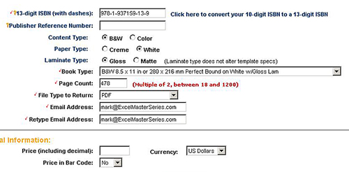
The above inputs are for a B&W, 8.5 X 11 inch, perfect bound book, white paper with gloss laminate having 478 pages. I am choosing to have this template emailed to me as a .pdf file that I will open up in Photoshop. Note that the bar code will not include price information. This is nearly always the correct choice if your POD book will be sold in online retail bookstores such as Amazon. I do a lot of experimenting with pricing for all of my hardcopy POD books. That would not be possible at all if the barcodes on my POD books contained fixed prices.

Below is a blank Lightning Source’s .pdf art cover template based on the preceding inputs:

Lightning Source Blank Artwork Cover Template

Lightning Source Blank Artwork Cover Template


This file then should be opened in Photoshop and the work begins. A specific procedure must be followed when opening Lightning Source’s .pdf template in Photoshop to ensure that bar code will contain only black and white without adding any color. If the bar code contains any color, the cover artwork .pdf file will be rejected by Lightning Source. Opening the .pdf template incorrectly in Photoshop is one major cause of color appearing in the bar code. Here is the correct procedure for opening the .pdf from within Photoshop:

– File / Open / browse and select the blank .pdf template saved on your computer that Lightning Source has emailed to you.
– The “Import PDF” dialogue box will appear. Enter the input choices as follows:
– Crop To:  Media Box
– Uncheck: Anti-aliased
– The Width and Height dimensions sent by Lightning Source of the blank template should be correct
– Check:  Constrain Proportions
– Resolution:  300 Pixels/inch
– Mode:   CMYK Color
– Bit-Depth:   8 bit

After you have correctly opened the template in Photoshop, you can begin creating the front and back covers along with the spine. Red dotted lines in the blank template define the edges of the Safety Region for the covers and spine. No artwork or printing should extend past the Safety Region. The blue dotted lines on the blank template define the edges of the Bleed Region. Background color should extend to the edges of the Bleed Region, but not past it.

The bar code on the back cover can be placed anywhere on the back cover. It does not have to remain in its original position in the blank template

The final cover artwork .pdf that will be submitted to Lightning Source must have the red Safety Region lines and blue Bleed Region lines removed. Everything else in the blank template can remain. When you are ready to save it in Photoshop as the final .pdf, follow this procedure:

– File / Save As
– Name the file:   13-Digit_ISBN_cov.pdf    For example:  9781937159139_cov.pdf
– Format:  Photoshop PDF
– As a Copy:  checked
– Alpha Channels:   unchecked
– Layers:   Unchecked
– Use Proof Setup:   Unchecked
– Embed Color Profile:   Unchecked
– Save
– Adobe PDF Preset:   [PDF/X-1a:2001]
– Standard:   PDF/X-1a:2001

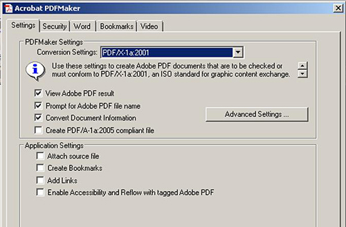
Saving the .pdf at the PDF/X-1a:2001 standard causes all colors to be converted to CMYK and ensures that the resolution is at least 300 ppi, which are two of the main Lightning Source requirements for the uploaded file. Here is what the final cover artwork .pdf in this case looked like: 

Final Cover Artwork .pdf File Ready for Upload to Lightning Source

Final Cover Artwork .pdf File Ready for Upload to Lightning Source

This cover artwork file is now ready for upload to Lightning Source. It will be a large file because of the 300 ppi resolution throughout. This particular file was 10.9 MB. Let’s move on to creating the black-and-white content file.

Second step – Create the New B&W Content File

The only difference between a color POD book and a Black-and-White POD book is the color of the text and images. The B&W book must have all images in gray scale and all text in black.

Converting all text to black is simply a matter of all selecting all of the text in the entire document (In MS Word click Edit / Select All) and setting the Font Color of the entire selection to black.

Converting all of the images to gray scale will take a bit more work.


How To Convert Color Images To Grayscale

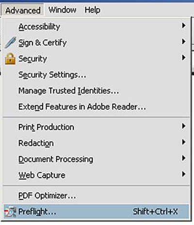
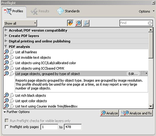
To summarize the process, you’ll need to open each image in Photoshop, set the image’s color mode to grayscale, and ensure that the image is sized properly. After each grayscale image is inserted into the document properly, the document must be saved as a .pdf file that meets the PDF/X-1a:2001 standard, just like the cover. The final step is to run a check called the Preflight check in order to ensure that the entire .pdf file conforms to the same PDF/X-1a:2001 standard that the cover artwork .pdf file conforms must conform to.

The first thing to do is open each image file in Photoshop. The best and safest way to resize and transform an image in Photoshop is to first open it as a “Smart Object.” A Smart Object is a container-like layer that almost anything can be opened up in. No matter what you do to an image opened up as a Smart Object, Photoshop remembers all of the information about the original image and places that information back into the file.  To open an image as a Smart Object, click File / Open As Smart Object as shown below: 

Photoshop Opening an Image As Smart Object

Photoshop Opening an Image As Smart Object

Once the image is opened as a Smart Object in Photoshop, set the image’s size and resolution properly. Click Image / Image Size / and then set the correct setting in the Image Size dialogue box as shown below. The resolution for an image in a POD book should be set to 300 ppi (pixels per inch). Images that consist of line art should be saved at 600 ppi resolution.

The Width and Height dimensions in the Document Size box are the other two measurements to be set. For an 8.5 X 11 inch POD book, I try to make sure that an image’s width never exceeds 5.5 inches and its height does not exceed 8 inches.

The Pixel Dimension setting of width and height would be the dimension to be set if the images were going to be viewed onscreen, such as in an .epub eBook. For an .epub file, I try to ensure that all images are 72 ppi and no more than 500 pixels in width or height. Note that convention is to state the width dimension before the height dimension. Below is the Image Size dialogue box:

Setting Image Size and Resolution in Photoshop

After setting the size and resolution of the image correctly, change the color mode to grayscale. Do this by clicking Image / Mode / Grayscale. If the image was not originally in CMYK mode, select CMYK mode first, and then select Grayscale. When you select the color mode (CMYK or Grayscale) you will be asked if you want to rasterize the image. You do want to allow Photoshop to rasterize your image at this point. Below is the menu selection of Grayscale.

Setting Image Color Mode To Grayscale in Photoshop

Setting Image Color Mode To Grayscale in Photoshop

Now that your image is properly sized and in grayscale, you can go ahead and swap out the old CMYK color image with the new grayscale version that you just created.

I like to create my content files using MS Word because it is so convenient to make changes. Another big reason that I usually create my content files in Word and not Adobe InDesign is that all of my clients will have MS Word on their computers. I can send my file to them as I am working on it to get their immediate feedback. I couldn’t do that if I did my content files in InDesign because most of my client don’t use InDesign. I don’t dislike InDesign. In fact, it is really a much more capable publishing program than Word. It’s just that my client don’t use it very often.

I am assuming that you have created your content file in MS Word. If you have swapped out all of the color images with grayscale CMYK images, you can now convert the Word document to the final .pdf content file that will be uploaded to Lightning Source.

The best tool to have on your computer for this is Adobe Acrobat. If Adobe Acrobat is loaded on your computer, you will have an Adobe PDF menu item in Word (this is the 2003 version) as shown below.

You’ll need to ensure that the .pdf file will conform to the PDF/X-1a:2001 standard required by Lightning Source. To do this, click MS Word drop-down menu item Adobe PDF / Change Conversion Settings as shown below:


Adobe Acrobat Change .pdf Conversion Setting

Adobe Acrobat Change .pdf Conversion Setting


The following Acrobat PDFMaker dialogue box will appear. Set Conversion Settings to PDF/X-1a:2001 and make sure Create Bookmarks and Add Links is unchecked. The PDF/X-1a:2001 setting will, by default, set all colors to CMYK. Leave security defaulted to none. Make sure that the page size is set correctly by clicking Advanced Setting / General /  Default Page Size. An 8.5 X 11 inch book should have the width and height settings at 8.5 and 11 inches. All other settings should be defaulted correctly.

Adobe PDF Maker - Correct Settings

Adobe PDF Maker - Correct Settings

After setting the Acrobat PDFMaker dialogue box correctly, convert the Word document to the final .pdf by clicking Adobe PDF / Convert to Adobe PDF.  It can take a little while for your computer to complete this process because the final .pdf file can be very large, particularly if there are lots of images. Images at 300 ppi are large files. The content .pdf file of the book shown here, Practical and Clear Graduate Statistics in Excel, was 101 MB.

After this .pdf file is created, it needs to be checked to ensure that it meets the PDF/X-1a:2001 standard required by Lightning Source for POD input files. The test to ensure that the PDF/X-1a:2001 standard is met is called a Preflight check. This is named after the check that pilots perform on the place before take-off.

Open the .pdf file in Adobe Acrobat. I use Acrobat Professional Pro Extended version 9.0. It is expensive software but worth every penny if you do lots of work with .pdf files.

To bring up the Preflight check on the .pdf content file loaded in Adobe Acrobat, click drop-down menu item Advanced / Preflight as shown below: 

Selecting the Preflight Check In Adobe Acrobat

Selecting the Preflight Check In Adobe Acrobat

ThePreflight dialogue box will come as shown below. Select PDF Analysis and then select “List page objects, grouped by type of object” as shown below:

Specific Preflight Check Selection

Specific Preflight Check Selection


You are most concerned that all images are at least 300 ppi and CMYK. 

Preflight Check Output

Preflight Check Output

Below we are expanding the image section of this report to view resolution and color mode of all images.

Specific Preflight Check Output

Specific Preflight Check Output


After you have uploaded the cover artwork and content .pdf files to Lightning Source from their web site, you will find out within usually 24 hours whether you have created both files correctly. If both files have been created correctly, you will see the following.

BOOKBLK Accepted  (BOOKBLK is the content .pdf file)
COVER Accepted

I have ordered a proof to be made and shipped to me. Below shows that this proof has been generated, but has not yet been shipped to me. 

Lightning Source Title Status - Cover and Content Files Accepts & Proof Generated

Lightning Source Title Status - Cover and Content Files Accepts & Proof Generated

I received the proof of this B&W version of the book and it looked great. Once again, great job by Lightning Source and now I should be able to make a lot more money selling this book in B&W than in color.

ePub Author Question – Should My Book Be in Color or Black and White?

Color printing is great but it will really jack up the retail price of your book’s hardcopy version.  I’ll show you the figures for one of my books printed in both B&W and color. The difference between the retail prices of each print type needed to provide the same royalty per sale is almost astonishing.

Clarify the Question

Before we break out the numbers, let’s clarify the opening question. What we are really asking is whether the hardcopy version of your book (the Print-On-Demand version if you are self-publishing) should have color images or black-and-white images. A book’s images are the only difference between the color book and a black-and-white versions of the same book. Both versions can have the same full-color cover and same B&W text. The difference between the two is whether the book’s images are printed in color or in gray scale. The images that appear in a B&W book have been printed in gray scale using only black ink. The images in a color hardcopy book have been printed in a color mode called CMYK.

The question of whether to use color or gray scale images is relevant only to printed, hardcopy books. An eBook’s price is not affected by the amount of color contained in the images. eBook images are displayed on the screen of an e-reader. Adding color to an eBook’s images doesn’t add cost to creating the .epub file or displaying the images. Printing a colored image on paper, on the other hand, is way more expensive than printing a gray scale image.

How much more expensive? Here are the numbers for one of my books.

If you are self-publishing, you’ll be using a print-on-demand (POD) company to print and ship your hardcopy books. The POD company partners directly with all online bookstores. When an Amazon customer purchases a hardcopy book, the order is sent to the POD company, who then prints and ships the book to the customer.  The only involvement that you the self-publisher have in this whole sales process is to receive royalty payments at the end of the day. Not bad.

Lightning Source as a POD Company

I use Lightning Source is my POD company for one simple reason. They allow me to make the most money. Lightning Source is the largest POD company with the most retail partners in the world. Lightning Source’s clout makes them the only POD company that can dictate to Amazon what Amazon’s wholesale discount will be. I set my wholesale discount for all of my POD books at 20%. That means that Amazon will receive only 20% of the sale price of one of my POD books. That is significant considering that Amazon keeps a full 65% of sale price of most of my Kindle eBooks.

Lightning Source also gets paid during the sale of each hardcopy book. Lightning Source is the printer and charges a fixed fee for printing each book during each sale. Lightning Source’s fixed printing fee depends on the type of printing, the binding type, and the number of pages in the book.

Lightning Source’s Publisher Compansation Calculator

Lightning Source has a convenient Publisher’s Compensation calculator on their web site that enables you to determine the retail price of your book that will provide a specific royalty payment. Simply input the following information into Lightning Source’s Publisher Compensation calculator:

– Type of book (color or black-and-white)

– Binding type from Lightning Source’s available choice of bindings

– Page color (white or creme)

– Number of pages

– Wholesale discount (the percent of the sale price that you allow the retailer such as Amazon to keep)

– Retail price of your book

The Publisher Compensation calculator then displays Lightning Source’s print charge and your publisher’s compensation.

Here Are the Actual Numbers

Here are the number for one of my books, just to illustrate the difference in pricing between the color and black-and-white versions of the same book.

One of my better-selling books is a 478-page manual entitled Practical and Clear Graduate Statistics in Excel. I originally printed the book in color and was selling it in hardcopy from Amazon at a retail price of $79.95. My royalty from each of these sales was $19.94. Here are the inputs and output of Lightning Source’s Publisher Compensation calculator in this case:

Numbers for the Color Book

– Color, 8.5 X 11 inches, Perfect Bound on White Pages with Gloss Laminate

– 478 Pages

– $79.95 List Price

– 20% Wholesale Discount

Outputs

– $44.02 Print Charge

– $19.94 Publisher Compensation

If I simply convert all of the book’s images from color to gray scale and sell the book as a black-and-white book, here are the new figures (make sure you are sitting down when you read these):

Numbers for the Black-and-White Book

– B&W, 8.5 X 11 inches, Perfect Bound on White Pages with Gloss Laminate

– 478 Pages

– $39.95 List Price

– 20% Wholesale Discount

Outputs

– $9.90 Print Charge

– $22.06 Publisher Compensation

By merely converting all images to gray scale, I was able to cut the book’s retail price in half and increase my profit from each sale. The difference is that the black-and-white print charge is only $9.90 compared to $44.02 for color.

Conclusion

If you want to earn the most money from the sale your books in hard copy, use Lightning Source is your POD company and sell your books in black-and-white.

ePub Author Question – How To Create a Great Amazon Cover Image That Will Sell Lots of Books

A book’s cover and its Amazon cover image are often very different but guess which one is more important?  Outside of brick-and-mortar book stores, a book’s cover won’t help sell at all. But who cares? Independent authors sell almost exclusively online. The Amazon cover image, on the other hand, is the second most important factor in getting a book sold online.

The book’s cover needs to be attractive when held in the hand but it’s the Amazon cover image that sells books. Well, not sell exactly. More like set the appointment for the closer. Amazon sales are closed by the book’s description, reviews, and Amazon’s “Look Inside” feature. The Amazon cover image and its partner in crime, the title, need to hijack and overwhelm the curiosity of a casual Amazon browser in a split second. The Amazon cover image is lethal if it is loaded with the following three bullets:

1) Instantly legible title

2) Striking

3) Simple

First, contrary to popular belief, the book’s cover and the Amazon cover image do not have to be the same. They need to be similar not necessarily identical. Both need to have the same theme but the Amazon cover image is often most effective when it is a simplified version of the book’s cover.

How To Simplify a Book Cover Down To a Great Amazon Cover Image

Simplifying the book cover down to an effective Amazon cover image means doing the following:

1) Remove all text except the title and subtitle. Keep the subtitle only if it is brief.

2) Ensure that the title is instantly readable. It should be near the top, stand-alone, highly contrasted from its background, and large. Chose a font for the title that fits the theme and genre but remains easy-to-read when shrunk.

3) Use only one graphic. More than one graphic makes the postage-stamp-sized Amazon cover image too busy to stop a casual Amazon browser. That one graphic needs to be a grabber.

4) Ensure that each item, whether text or an image, is in its own space. Nothing should overlap.

5) Use only a few colors. The background should be only one color.

6) There should be only one focus. Anything else makes the Amazon cover image too busy.

7) Contrasts between elements and the background should be strong.

8) Your book’s genre should be instantly conveyed by the Amazon cover image.

9) The Amazon cover image should have similarities to others in its genre but must stand out in a noticeable way.

The Amazon cover image needs to have an outer edge to contrast it from the white background of its placeholder. If your Amazon cover image is white on its edges, you are allowed to outline it with a thin, black outline. An Amazon cover image that has white edges will fade into the placeholder background and not look like a book at all. Any momentary confusion generated by your Amazon cover image will prompt Amazon browsers to simply continue browsing.

Characteristics of an Ineffective Amazon Cover Image

You will lose sales if your Amazon cover has any of the following:

1) Hard-to-read title

2) Too many elements

3) Too much to read

4) A main image that doesn’t grab attention

5) No outside edge

6) Elements overlapping each other

7) Too many colors

8) Not enough contrast between elements and the background

9) More than one focus or focal point.

10) Doesn’t stand out from others in its genre

The Postage Stamp Rule

Pretend that you are creating a postage stamp. An Amazon cover image is just about the same size so this technique is very applicable. Postage stamps have only a single, striking image. The text on a postage stamp is stand-alone and easy-to-read. Nothing overlaps on a postage stamp. Postage stamps have only one background color. Postage stamps are always simple, never busy. Of course you can create a much more striking Amazon cover image than a postage stamp because of the fonts, images, and background colors that you have at your disposal. The important point is that your Amazon cover image needs the simplicity, contrast, a single focus, and legibility of a postage stamp.

View your Amazon cover image as it would be seen on Amazon by sizing it to approximately 1.5 inches in height and then save it as a jpeg at 72 ppi with 50% resolution. How’s it look?

The Billboard Rule

Imagine the you’re speeding down the highway and a billboard briefly catches your eye. What did you briefly notice? The billboard’s headline and one image if it was large enough….Anything else? Nope. But…what about all that great advertising text and artwork all over the rest of the billboard? Of course not. And why would any of that stuff be on a billboard anyway? The drivers are speeding along and the faraway billboards look tiny from the road.

You probably see where this is going. You’ll do well to create your cover image for the Amazon catalog is as you were designing a billboard to place beside a highway a ways back from the road. Place only enough on that billboard to catch your potential customers eyes as they are speeding along Amazon Highway. Just like on a highway billboard, anything beyond just a few main items will clutter, crowd, and confuse your book’s billboard on the side of Amazon Highway and your customers will just keep speeding along until a more focused billboard grabs their limited attention.

How To Know That You Have Created an Effective Amazon Cover Image

You’ve probably created an effective Amazon cover image if you are happy with your answers to the following questions:

1) How conspicuous and legible is the title?

2) Is your Amazon cover image busy or is it simple and focused?

3) If you have an image, will the image stop casual Amazon browsers in their tracks?

4) Is the overall contrast sufficient to make every element on the image stand out?

5) Is each element in its own space or is there any confusing overlap among elements in the image?

6) Does the Amazon cover image make the book’s genre instantly clear?

7) Does this Amazon cover image stand out from others in the genre?

ePub Author Question – How To Work With a Cover Artist To Create a Great Cover

How Important Is Your Cover?

A great cover will sell a lot more books than a mediocre cover. Your cover, particularly the thumbnail image, has to grab the casual Amazon browser who is skimming through rows of thumbnails in your genre. The book market is becoming crowded FAST – over 1,000 new books go on sale every day. You need to put your best foot forward and that best foot is a strong cover image.
 

Should You Create Your Own Cover Or Hire a Cover Artist?

Unless you are an experienced cover artist with demonstrated success, you should hire a freelance cover artist to do your cover. It will cost you at least several hundred dollars but will be one of the wisest investments you’ll ever make in your book.  If you have written a good book, the increased sales from a great cover will recoup your investment quickly. Paying a cover designer should not be thought of as a cost but as an investment that will pay for itself many times over.
 

Where Do You Find a Good Cover Artist?

1) Look at the web sites of a number of graphic designers and find several whose style you like the best. Make sure that the graphic designers who make your short list have experience doing book cover design. There is a learning curve, particularly when creating the cover artwork .pdf file for Print-On-Demand. Files submitted to a POD company such as Lightning Source have to meet a number of technical specifications exactly because these files go right into production. The cover artist needs to be experienced in creating these files.

2) Join author groups. Author groups are great sources for locating every type of professional help that a writer might need.

3) Graphic design schools have lots of talent that should not be too expensive. If you opt to employ a graphic design student, make sure that the student has the experience you need and is willing to work with a contract and meet deadlines.

4) Look on the covers of hardcopies and ebooks in your genre. The artists are sometimes listed on the cover.
 

What Are Important Questions To Ask the Cover Designer Before You Hire Him or Her?

1) The most important aspect of working with a cover artist is that you feel comfortable working with him or her. If you are a bit uncomfortable with an artist after one or two communications, you probably should continue your search.

2) Pay attention to the number of questions that the artist asks you. The more questions that the artist asks about your book, your concept, and your goals, the more likely you are to get a final product that is inline with what you want.

3) Ranking right up at the top of the list is the designer’s experience in creating book covers. How many did the artist do? How many in your genre? Take a look at them.

4) You should request a contract with your artist. If the artist doesn’t do a contract, he or she may not bring the professionalism to the table that you’ll want.

5) You need to have the right to use the artwork forever. If you have to renew a license in order to continue to use the cover artwork, you are taking a big risk. Your artist could move, raise licensing prices, or even refuse to relicense because of disagreement. The worse-case scenario would to lose a license for cover artwork used on a series of books. In this case you would have to redo all of the covers. Any brand equity that had been built as a result of cover recognition for your series is instantly gone. You never want to license cover artwork temporarily.

6) You need to get everything clearly spelled out regarding what you will be billed for. Cover artists often bill hourly. Find out what tasks are considered billable. You want to be paying your artist for creative artistic and design work. You don’t want to pay the artist for tasks that you could do yourself. If, for example, the artist bills for image searches, you might consider providing the images yourself. There are also lots of sites that you can find royalty-free images on. There are also plenty of well-known sites that sell the right to use images.

7) Related to the above point is a payment schedule. Make sure that payment terms and schedule are clearly spelled out. The artist may also request a downpayment, sometimes up to 50%.

8) The total cost for creating your cover will be at least several hundred dollars, maybe even more depending on how unique you want your cover to be. Be wary of a cover designer whose price seems too good to be true. You may not get the experience, amount of interaction, or the effort that you would like from the artist.

9) You’ll want to get a production schedule from the artist, complete with deadlines.

10) Don’t expect your cover designer to create illustrations, perform photography, or to have to secure the rights for images for your cover. If you have provided the images, you have relieved the designer of liability for copyright infringement. You may have to provide extra money to the artist if you would like him or her to locate stock images for your cover.

11) Make sure that cover designer can create the proofs in the form and format that you need. For example, if you are creating a cover for a Print-On-Demand hardcopy for Lightning Source or CreateSpace, you’ll be provided a custom .pdf template by the POD company. It is best if your cover designer has created covers in the past for the specific POD company that you intend to use. Each POD company has its own set of specifications and templates. You would rather have your cover designer at the top of that learning curve than at the bottom looking up. I can recommend Lightning Source as a POD company and have used them for all of my POD books. I have not ever used CreateSpace so I can’t  provide first-hand information about them, although I’m sure they do a great job as well.

12) Ask how many cover ideas you will initially receive from the artist. It is not uncommon for a cover designer only to provide a single cover concept and work from there. In the past, cover designers often provided more than one cover concept.
 

How Do You Work With Your Cover Artist To Get the Best Result?

1) Provide the cover artist with a detailed brief about what you would like for your cover. Your brief should provide your ideas about what overall effect and mood you would like the cover to evoke. Provide your ideas about color schemes and any other ideas of artistic expression related to the cover that you have.

2) Make sure your brief contains all necessary factual information such as page count, ISBN, binding format, binding size, color or black-and-white printing on pages, color of pages (for example, crème or white), and the name of the POD company that will be printing your book. Each POD company has its own technical specifications and template. You’ll need to provide the cover artist with enough information so that the artist can download a custom template from your POD company.

3) Your input should important to the designer. Equally important from your end is  to respect and trust  the designer’s creative, artistic abilities. The designer hopefully has worked on many more books than you and should know a thing or two. If you have found a good cover artist, listen to him or her. Your cover artist is the expert in the field of cover design. After all, you are shelling out good money for that expertise. You might as well get your money’s worth.

4) Don’t expect your cover designer to take photographs or do illustrations, Cover designers combine and manipulate images and type face to create effective covers. If you wish the artist to locate images for use on your cover, you may have to pay extra.

5) Be open to an experienced designer’s suggestions of how to change the cover concept to appeal to a wider audience. Authors sometimes define a book’s  target market too tightly.

6) Always insist on a contract with deadlines, payment terms, definition of billable hours, artist’s deposit requirement, copyright retention terms for the cover design, definition and specifications of what the final product will be, how the final product will be uploaded to the POD and also included in an .epub/.mobi eBook file if this will be created.

7) Learn as much as possible in advance about the publishing process and what the specifications required by the POD company mean. Get the cover artist to define the publishing process and also explain all of the POD specifications including the custom template in detail to you. The more you know about the entire process at the beginning, the more likely that the final product will meet your satisfaction. Get the cover designer to go over the template with you and explain what the “bleed” and “trim” areas are. It’s not as complicated as it may sound. The cover artist should be able to explain all of the POD company’s specifications and template in simple, understandable terms.

8) Expect the artist to respect your wishes if you have very strong feelings about some aspect the cover design. On the other side of the coin, respect the artist’s experience and talent. Try to keep in mind that the artist probably has worked on quite a few more books than you have.

9) Request changes if you see something that you would like changed. Before you request any changes, try to clarify exactly why you want the change. Be prepared to listen to the artist’s reasoning on why he or she created and laid out the elements of the cover in that way.

10) If you ask for lots of changes, expect to pay more for the additional work.

11) At the end of the day, do you best to hire talent, provide as much information as you can, and then try as much as possible to trust the skill, creativity, experience, and judgement of your cover designer.

ePub Author Question – What Goes Into a Great Cover?

Why Is a Cover So Important?

People do judge a book by its cover and a great cover will sell a lot more books. In the online world, a cover can make or break a book. Your cover is the most important selling tool that you have. Quite a few self-published authors don’t understand the importance of a great cover. Your cover is your billboard that will convey your book’s excitement and uniqueness. Just like a billboard, your cover has maybe 6 seconds tops to grab the casual Amazon browser.

The book market is becoming crowded FAST – over 1,000 new books go on sale every day thanks to the recent advances of self-publishing. Your book must stand out. Period. An amateur cover will make your book look, well…, self-published. The bottom line is that you’ll sell a lot more books with a great cover.

Should You Create Your Own Cover Or Hire a Cover Artist?

Unless you are an experienced cover artist with demonstrated success, you should hire a freelance cover artist to do your cover. It will cost you at least several hundred dollars but will be one of the wisest investments you’ll ever make in your book. Cover artwork, editing, and marketing are three areas that you need to spend money. Skimping on any of these will knock the wind out of your book sales.

If you’re a writer, write. Leave cover design to a professional cover designer. There is almost no chance that an inexperienced person will create a more effective cover than a pro cover designer (or even come close, or… even do a good job at creating a cover). Cover design is definitely a job for a pro.

The few hundred dollars that a great cover costs should pay for itself with increased sales almost immediately. The money you spend designing all of your covers might be the most effective investment you can make toward your long-term success as an independent author.

Another article in this blog will discuss how to locate and work with a skilled cover designer to create a great cover.

Should You Create a Cover with One of the Cover Template Packages Available?

There a lots of packages out there that provide templates which enable anyone to create a cover in no time. However, with 1,000 new books coming out on the market every day, a template-created cover won’t give you an edge. It will make your book a “me too” book. It’s not that hard to spot a cover that was created from a template. Hire a pro cover designer if you want your book to persuade a casual Amazon browser of your book’s genre to stop and take a look. That is the crucial first step on the path to the “Buy” button. Your book will not standout in the crowded market if you create your cover with a template.

The Most Important Rules of Cover Design

– By far the most important rule in cover design is to know your audience. You need to understand your genre and who reads it. Inspect as many books in your genre as you can. What are the similarities? What differentiates cover art work of the best sellers? What about the ones that aren’t selling well? The top selling books will always be ranked higher in an Amazon search of your book’s genre.

– Don’t worry about trying to appeal to everyone. The more specifically you know your book genre’s audience, the more accurately you can target them with your cover. The more focused your cover is on your genre’s audience to the exclusion of everyone else, the more books you’ll sell. That might sound illogical but is based of one of marketing’s most powerful principles of focusing the marketing efforts on the target market.

– Know the USP (Unique Selling Proposition) of your book. If you are writing nonfiction, your book needs to be solving an important problem that faces your target audience. The cover must instantly convey that your book will solve this problem. If you are selling fiction, your book must be providing a desired experience to your target market. The cover must instantly convey the experience that your target reader is seeking. Do you have an intimate understanding of the type of experience that your target audience is seeking? Can you articulate how the covers of some of the best-selling books in your genre individually convey that experience?

– The cover must make the genre clear in a second or two. If your cover’s presentation of the genre is even the slightest bit confusing to the casual Amazon browser, they’ll move on and you’ll lose a ton of sales. Clarity often trumps cleverness here.

– The cover must look professionally done. It is easy to tell if the cover was made using a template or by a person without cover design experience. An amateur cover is a sales killer.

– The cover needs to be clear and look great as a thumbnail. The title and subtitle should be clear on the Amazon thumbnail.

– A poor cover thumbnail will absolutely hammer your book’s sales. Believe it or not, the thumbnail image of your cover is more important than the full-size image. People now buy books online much more than in book stores. This creates a quantum shift in cover creation. The cover thumbnail must grab the casual Amazon buyer of your book’s genre. If your cover’s thumbnail isn’t instantly clear or does not resonate immediately with your target audience, you’re handing over book royalties that should be yours to a competing author. Tragic!

– Simplicity is generally better with covers. Clutter on the cover is major distraction to the casual Amazon browser, who needs to be able to instantly figure what’s special about the book. Simplicity also translates to a much better thumbnail.

– The cover should be eye-catching to differentiate the book from the crowd. Always remember that 1,000 new books are coming online every day.

– If you are writing any kind of a series, the cover should quickly identify the book as part of that series. Your covers create your brand. Consecutive books in your series must be instantly identifiable as part of that series.

– Your book cover should look like others in its genre, but stand out in some significant way that resonates with your target audience. It is very important that you can articulate specifically what makes your book special to your target audience. Just being different is not the key. Being different in a way that is important to your target is the key. Your title and cover need to clearly reflect this difference.

– Your title should be large and usually at the top of the cover. Keep the clarity of the thumbnail in the forefront of your thinking when creating all elements of the cover.

– The typography should match or be similar to typography of other books in the genre. Check out the typography of best-sellers in your genre. You’ll probably see a lot of similarity in typography. You might also see several distinct styles of typography that most of the best-sellers in your genre will fall into.

– The outer edges of your front cover should not be white. Your book’s front cover should be framed on all edges with color, preferably a darker color. A white edge will fade into the white background of the Amazon space holder. The viewer won’t be able to see the book’s outline and the book will not look like a book at all. Any confusion will prompt a good percentage of casual Amazon browser to simply move on to the next book.

– Always remember that the main purpose of the book’s cover is to persuade the browser to take the next step. Maybe that next step is to read the online product description or to take a look at the online book reviews. Maybe that next step is to persuade the viewer to read a sample of the book.

– The book’s title and cover thumbnail need to be traffic stoppers. The first step in the book selling process is catch your target audience’s attention. That’s your title and cover’s main job. If they are not doing their job, you’re handing hard-earned royalties over to a competing author. Amazon browsers will keep browsing until a title and cover grabs them. Make sure your title and cover have stopping power in your genre.

– The book’s spine should have only plain colors. No designs on the spine.

– Establish what the principal focus of your cover is. The principal focus of the cover should be the  book’s USP (Unique Selling Proposition), which is the main benefit that a reader will get from your book. Everything on the cover should sell your book’s USP. Every element on the cover either adds to selling the book’s USP or detracts from it. Evaluate every element on the cover.

– The title by itself should convey the book’s USP. Very important. The title and cover thumbnail need to stop traffic. They will only stop traffic if they clearly sell a USP that is highly sought-after by your target audience.

– Too many elements on a cover will also distract from the USP that the cover needs to quickly convey to the casual Amazon browser. Once again, simplicity is usually best.

– Don’t use too many colors. It is a bit confusing to the casual browser because it will make the cover thumbnail overly busy. Once again, simplicity is usually better. Use just a few colors.

– Don’t take the cover too personally. Let the cover designer do his or her thing. You should of course have lots of input into the design of your cover. It is important to remember that covers (at least, good ones anyway) are not usually created by the authors. Authors often have to detach themselves personally from the cover and put on the hat of an unrelated publisher who is trying to sell the book.

– Important stuff usually belongs in the top and right side of the front cover.

– Back to the first and most important point in this list – know your genre’s audience and study lots of book covers in your genre. What makes a good cover good? What makes a mediocre cover mediocre? Get specific. You really want to understand what signals “a good read” to your genre’s audience and why. This is the number one rule of creating a great cover.

What Goes On The Front Cover?

– Brief and concise title and subtitle

– Images

– Bullet points

– Short lists (usually with bullet points)

– Very persuasive testimonials or endorsements

What Does Not Go On The Front Cover?

– A very long title

– Any visual or image that distracts from the main selling proposition of the book

– Anything related to the price

– Testimonials or endorsements that are not powerful

What Goes On The Back Cover?

– Genre category in the upper left corner. Here is a link to: http://www.bisg.org/what-we-do-0-136-bisac-subject-headings-list-major-subjects.php  which list all major book subject heading and all 2800+ subcategories of books of the Book Industry Study Group.

– Sales copy. The back cover should make the browser want to take a next step and find out what’s inside.

– The sales copy should have a headline (tag line) and maybe a subheadline which need to be compelling and tell the browser why he or she needs to have this book.

– The sales copy should be short, sweet, and direct. Use bullet points if nonfiction. If fiction, present just the important details that will hook the browser.

ePub Author Question – What Are the Parts of an ePub File?

Let’s open up the hood and see what’s inside an ePub.

The first thing to know is that an ePub file is actually a compressed collection of files, just like a .zip file. In fact, if you make a copy of an ePub file and change the ePub’s file extension from .epub to .zip, you would have the following .zip file that can be unzipped to extract the contents so we can view them: 

An ePub file and a copy of the file with the file extension changed from .epub to .zip

An ePub file and a copy of the file with the file extension changed from .epub to .zip

We can now unzip the .zip file and view its contents. After unzipping, we see that an .epub file consists of the following two folders ( the OEBPS folder and the META-INF folder) and one file (the mimetype file):

The main three parts of an ePub file: two folders (the OEBPS folder and the META-INF folder) and one file (the mimetype file).

The main three parts of an ePub file: two folders (the OEBPS folder and the META-INF folder) and one file (the mimetype file).

 
If we open the META-INF folder, we can see that it has one file (the container.xml file) as follows: 

The one file in the META-INF folder - the container.xml file.

The one file in the META-INF folder - the container.xml file.

The container.xml file provides the location of the content.opf file as shown in the following image. The content.opf file contains important information such as the epub’s metadata (author name, published date, etc.), manifest (a list of every item in the epub file), and the spine (the order in which items are viewed as the reader scrolls through the epub). The content.opf file will be discussed shortly.

There will be additional lines of code in the container.xml file if encryption or digital rights management has been added to the ePub file. The container.xml file has been opened up below in the text editor Notepad++, which works well on a PC. You might use a text editor such as Text Wrangler if using a Mac.

The container.xml file provides the location of the content.opf file.

The container.xml file provides the location of the content.opf file.

Below is the mimetype file opened in Notepad++. The sole purpose of the mimetype file is to indicate that this is an ePub file.

The mimetype file has just one line which states that the file is an epub file.

The mimetype file has just one line which states that the file is an epub file.

 
Clicking on the OEBPS (Open eBook Publication Structure) folder reveal the following three folders (the Images folder, the Styles folder, and the Text folder) and two files ( the content.opf file and the toc.ncx file):

OEBPS folder's three folders (the Images folder, the Styles folder, and the Text folder) and two files ( the content.opf file and the toc.ncx file).

OEBPS folder's three folders (the Images folder, the Styles folder, and the Text folder) and two files ( the content.opf file and the toc.ncx file).


Opening the content.opf file in Notepad++ reveal three main parts of this file. The first part of the content.opf file shown below contains all of the metadata (author name, publication date, etc.) for the ePub file. The second part of the content.opf is the manifest for the entire ePub file. Every item in the entire ePub file is listed in the manifest. 

The content.opf file's metadata section and the manifest section.

The content.opf file's metadata section and the manifest section.

The third part of the content.opf file is the spine. The spine, shown below, provides the order in which the parts of the ePub file will be viewed as the reader scrolls through the ePub eBook. 

The content.opf file's spine section.

The content.opf file's spine section.

If we open up the toc.ncx file in Notepad++, we can view the contents of the ePub’s built-in navigational table of contents as follows: 

The toc.ncx file showing the built-in navigational table of contents.

The toc.ncx file showing the built-in navigational table of contents.

 Clicking on the Text folder reveals the collection of XHTML files that are the contents of the ePub eBook. Each XHTML file is a single section of the eBook.

The Text folder's XHTML files. Each XHTML file is a separate section of the ePub eBook.
The Text folder’s XHTML files. Each XHTML file is a separate section of the ePub eBook.

Opening up one of these XHTML files (New_Manuals.xhtml) shows the XHTML code. This is the same code that appears on web pages. An ePub file is just like a mini web site. One line of code contains a hyperlink and the last line links to an image, just like the HTML on a web page. 

The XHTML code of one of the sections of an ePub file, just like a web page.

The XHTML code of one of the sections of an ePub file, just like a web page.

If we open up any of the XHTML files in a web browser, it will open up just like a web page. We will open the above file (New_Manuals.xhtml) in the web browser Firefox and we’ll see that it views just like a web page, as shown below. This demonstrates how similar an ePub file is to a web site. In fact, the best tool to create an ePub is an HTML editor used to build web sites such as Dreamweaver or Microsoft Expression Web (my favorite).

Opening one of the ePub file's XHTML files in the web browser Firefox. This shows how similar an ePub file is to a web site.

Opening one of the ePub file's XHTML files in the web browser Firefox. This shows how similar an ePub file is to a web site.


Clicking on the Styles folder shows a CSS style sheet (stylesheet.css). The Styles folder will always contain at least one CSS style sheet. There can be more than one. Opening stylesheet.css in Notepad++ shows the CSS styles in this style sheet which control all formatting and styling in the XHTML pages. 

The CSS style sheet that controls all formatting and styling in this ePub document.

The CSS style sheet that controls all formatting and styling in this ePub document.

 The Images folder contain all of the images (jpegs, gifs, or pngs) in the ePub document as shown below:

All of the image file within the ePub document.

All of the image file within the ePub document.


Now you see how it all fits together and how an ePub document is very similar to a mini web site.

ePub Marketing – How Do I Set Up and Sell My eBook On My Own Site With ClickBank?

If you have written a book and also maintain a web site or blog focused on the same topic as your book, you may have a match made in heaven. You can monetize all that traffic to your site or blog if you can entice some percentage of your visitors to purchase your book. You could send interested prospects to your Amazon sales page but I suggest you close the sale right there on your site.

I’ve been selling my eBooks from my web site: http://excelmasterseries.com/  and my blog: http://blog.excelmasterseries.com/ a lot longer than I’ve been selling eBooks with Amazon Kindle. It has been a profitable undertaking for me because eBook sales from my web site is my second largest cash flow stream behind Amazon combined sales (Kindle  plus hardcopy print-on-demand units sold). The blog article written right before this one discusses the Pros and Cons of selling from you own web site using ClickBank for payment processing. This blog article discusses  how to set up your web site and account with ClickBank so you can sell your eBooks directly to visitors on your site.

First of all, what is ClickBank?

ClickBank was founded in 1998 and is a secure online retail outlet for more than 50,000 digital products and 100,000 active affiliate marketers. ClickBank makes a sale somewhere in the world every three seconds, safely processing more than 35,000 digital transactions a day. They serve more than 200 countries, and are consistently ranked as one of the most highly-trafficked sites on the web. ClickBank is privately held with offices in Broomfield, Colorado and Boise, Idaho and is a subsidiary of Keynetics Inc.

For me, ClickBank is my payment processor.

Visitors who purchase an eBook from my web site will go through this purchase and payment process with ClickBank:

1. A site or blog visitor arrives on one of my product sales pages: http://excelmasterseries.com/ClickBank/Students/Student_Excel_Master.php 

2. If the visitor clicks a purchase link on the above sales page, he or she would be directed to a ClickBank order form for the specific product Here is the ClickBank order form for the product in the sales page above: http://31.solvermark.pay.clickbank.net

3. When the visitor completes the order form, ClickBank processes the credit card or Paypal payment. As soon as the payment is approved, ClickBank redirects the visitor (now a customer!) back to the product download page on my web site. My product download page has links to  download the eBook in three formats (.pdf, .epub, and .mobi) and links to download free e-readers  for each format (Adobe Reader for .pdf, Adobe Digital Editions for .epub, and the mobipocket reader for .mobi). I also provide my book in the .lit format but I don’t count .lit as a valid format any more because Microsoft has discontinued servicing that format. The following four consecutive images below show what the download page for this product looks like:


Download Page on My Web Site For a Product Sold Using ClickBank As The Payment Processor


There is really not much to setting your web site up with ClickBank to process payments for the sale of your digital downloadable products. After you have set up a vendor account with ClickBank and created your digital products, you are immediately ready to begin selling those products through ClickBank.

Setting up ClickBank to Perform Payment Processing For a Digital Product Involves Just the Few Following Steps:

1. On your web site, create a sales page and a download page for each product, similar to what is shown above.

2. Log into your ClickBank account

3. Go To Account Settings / My Products / Add New Product

4. Provide the name of the new product and a brief description. Finally, provide the URL of the sales page and download page (called the Thank You page by ClickBank).

That’s all there is to it. There are guidelines that must be followed when creating the sales and download pages. These guidelines can be found on the ClickBank site.

When a sale is made….

When a sales is made, ClickBank will immediately send an email to me with contact information for my new customer. I will then send the new customer a personalized thank-you email right away (nearly always that day). This has enabled me to start a number of deep relationships with my customers. It also goes a long way in reducing the number of refunds requested. In the two-and-a-half years I’ve been selling through ClickBank, I’ve only had a handful of refund requests and I believe the personal follow-up emails are a big part of that.

ClickBank charges 7.5% of each sale, plus $1. That’s a lot less than Amazon Kindle and Lightning Source charge. I gross 35% of the retail price of each Kindle eBook sold and about 30% of the retail price of a print-on-demand hardcopy sold from Amazon. Each eBook sold from my web site through ClickBank grosses me between 85% and 90% of my retail price.

ClickBank send out electronic payments three weeks after a sale is made. My payments have always been prompt and correct.

ClickBank is also one of the largest affiliate companies. You can drop your digital products into their affiliate network. I have not done so because I feel that my information products are not well-suited for sales through affiliates.

I’ve been using ClickBank for quite a while and I am a big fan of theirs. I especially like ClickBank’s ability to smoothly process payments from every corner of the world. I can’t recall every having had a problem with that aspect of ClickBank.
 
I like to use Paypal’s convenient invoicing system if I want to send an invoice through email for a service such as converting a book to epub format. For downloadable digital products however, ClickBank payment processing can’t be beat.

ePub Marketing – What Are the Pros and Cons of Selling Your eBook From Your Own Web Site With ClickBank?

Many self-published authors can create a strong and dependable cash flow stream by selling their eBooks from the own web site. I sell my eBooks from my web site/blog using ClickBank as the payment processor and the results have been very good. My web site/blog has now become my second largest source of book sales behind Amazon. The purpose of this blog article is to provide a list of pros and cons of selling your own eBooks from your own web site with ClickBank as your payment processor based on my own experiences of having done it for a few years.

Here are the Pros of selling your own eBooks from your own web site using ClickBank as the payment processor:

1. Top reason, the money! Every eBook you sell from your web site is nearly 100% profit to you, with a small payment to the payment processing company (ClickBank in my case). Amazon Kindle Direct doesn’t get to keep 65%. Barnes and Nobles doesn’t get to keep 50%. The print-on-demand company doesn’t get any of the loot either. The money is all mine, mine, mine! Downloadable information products such as eBooks are perhaps the most profitable thing that can be sold on the Internet. Every part of the sale can be completely automated and the overhead is negligible.

2. The payments from ClickBank are weekly. Everyone else pays monthly. The payments are electronically deposited and I’m happy to get them every week.

3. ClickBank payments are sent out much more promptly than any of my other sources of online sales. For example, Amazon Kindle Direct pays out at the end of the second month after sales are made. Lightning Source pays out at the end of the third month after any print-on-demand hardcopy sales are made. ClickBank pays out three weeks after sales are made.
 
4. ClickBank combined with my web site expands my global sales much wider than Amazon does. At least a third of the eBooks I sell from my web site are sold outside of the US.  You can take a look at the customer testimonials of one of my books to get an idea of how wide-spread sales can be from your own web site: http://excelmasterseries.com/ClickBank/Students/Student_Excel_Master.php None of the well-known online book stores seem to have a strong presence outside of the US. My own Amazon eBook sales from outside the US are a small fraction of my US-based Amazon sales. My ClickBank sales come from every corner in the world.

5. ClickBank can handle credit card or PayPal payments in just about any currency and from any location. I don’t deal with any aspects of payment processing for sales from my own web site. ClickBank has been a very satisfactory, cheap, turn-key, multi-national payment processing solution.

6. Second top reason – ClickBank sends me contact information (name, email address, and location) of every customer who makes a sale from my web site as soon as the sale is made. This is HUGE! Every time I make a sale from my web site, I email that customer a personal note thanking them for the sale. I also try to mention something nice and interesting about where the customers lives. These emails are usually sent out within a few hours of each sale. The customers are delighted to get a surprise personal email from the eBook’s author right after the sale is made. I have been able to create a quite a few very close relationships with my customers that all started with that one follow-up email. I also have a large email list of every customer whoever purchased from my web site. Is any of that possible when selling eBooks through an online book store? Nope. Amazon and B&N aren’t about to give up their customer lists.

7. When I sell my eBooks from my own web site, I can sell in any format. Amazon Kindle eBooks are all .mobi. B&N (and most other online book stores) sell .ePub eBooks. Several online book stores, such as the Google book store, provide downloads in the .pdf format. If you purchase any eBook from my web site, you get all three types of downloads at no extra charge.

8. When you sell from your own web site, you can include extra bonuses with each purchase as an extra incentive to make the purchase.  If you click on this link once again:  http://excelmasterseries.com/ClickBank/Students/Student_Excel_Master.php and scroll down the page a bit, you’ll see the extra bonus e-manual that I provide each customer. Certainly this extra bonus e-manual was the right nudge that turned at least a few fence-sitters into customers. To my knowledge, Amazon does not provide authors with the ability to offer bonus eBooks. That might be an effective sales tool for Amazon.

9. Selling eBooks on your web site through ClickBank allows you to create a very personal download page. When a customer’s payment is successfully processed, ClickBank directs the customer back to a download page that is on your web site. Your download page provides you with all kinds of great opportunities, such as upselling and writing a personal message to the customer. You have nothing of the kind going on with Amazon.

10. Unlike Amazon browsers, your web site visitors will not be shown eBooks that compete with yours. I’ve always wondered how Amazon customers who were just about to buy one of my books changed their mind at the last second as a result of being shown something else by Amazon?

There are more Pros that could be added to the list, but we should also discuss the Cons as well. I have found selling my eBooks from my own web site through ClickBank to be overall very worthwhile, but every good thing has downside.

Here are the Cons of selling your own eBooks from you own web site:

1. Your web site sale cannibalize your Amazon sales. The more units that one of your books sells on Amazon, the higher Amazon will rank that book in its search engine. The higher your book come up during Amazon searches, the more you will sell. Instead of making a sale on my web site, I could direct interested prospects to the Amazon sales page of the same eBook. If I did that, I certainly would have higher Amazon sales right now. Selling my eBooks from my web site no doubt has reduced my Amazon sales. How much, I’ll never know.

2. It’s a LOT of work put together an effective selling web site. I put my whole site together myself: http://excelmasterseries.com/ but I bet I would have saved myself an enormous amount of work if had I simply used a template available for such a  web site. You need to have pretty good graphic design skills and along with solid HTML, CSS, and PHP knowledge to do it yourself. You could hire someone to do it for you, but that’s not cheap.

3. If your works are nonfiction, you’ll need a blog, I believe. Nonfiction writers need to establish themselves as experts in their field and blogs are a perfect tool to quickly do this. Blogs are excellent traffic builders. Google loves a site with a blog because blogs normally provide up-to-date, relevant information on a topic. You can place a sales form right in your blog, as I do in mine here:  http://blog.excelmasterseries.com/  In case you are interested, the Excel Master Series blog is a Blogger blog and the blog that you are now reading is a WordPress blog, just so you can see the differences. The downside of a blog – It is also a LOT of work to regularly write good articles. Before you begin a blog, you’ll need to make sure that you have a passion for the topic and won’t run out of material after 10 articles. You can install analytics (I use Google Analytics) into your blog to find out how many of your sales are coming directly from blog visitors.  You will probably find you blog to be an excellent source of direct eBook sales, but, once again, it’s a LOT of work to maintain a blog.

4. Sales from your site are totally dependant upon the traffic to the site. You need to become a good Internet marketer to generate that traffic. Becoming a competent Internet marketer is a long road filled with countless fruitless, frustrating dead ends. I can’t tell you how many “sure things” that I’ve tried which didn’t move the traffic needle even a blip. It’s hard to predict what will work and what won’t. Sometimes only one out of five things you’ll try will bring more traffic. I haven’t hit a get-rich-quick speed bump yet in my pursuit of Internet marketing wealth. I know I’m a lot better at it than I was a few years ago, but each step forward usually came after a couple steps back. Generating substantial Internet traffic to your site is a long-term proposition involving a LOT of work.

So, there you have it. The Pros and Cons of selling eBooks from your own web site, based on my experiences of doing so. At the end of the day, selling my eBooks from my own site has been a profitable and worthwhile endeavor, but not the easiest thing I’ve ever done.

Author Question – Why Does It Take So Much Longer To Create a Print-On-Demand Book Than an ePub?

You would think that a book is a book is a book is a book, regardless of its final, destination format. Quite the opposite is actually the case. Yes, the content will be the same,  regardless of final format. But, that’s where all similarity ends. The differences between creating the files for POD (print-on-demand) and the files for an ePub are greater than night and day.

Before we go into the differences between creating POD and ePub, here is briefly what they both are. If you are a self-published author and your books are available on Amazon, your hardcopies will be sold in the form called print-on-demand and your Kindle eBooks will be sold in the format of .mobi, which is very close to the .ePub file from which it is derived. You, the self-published author, interact directly with Amazon Kindle Direct. Any eBooks or updates that you upload to Kindle will go live the next day.

In the case of POD, you are interacting only with the POD company. The POD company is a third-party aggregator and will conduct all interaction on your behalf with all online book stores for the sale of your hardcopies. Any POD files or updates that you upload to the POD company will take much longer to go live in the online book stores.

Now here are the reasons why it takes so much longer to create the files for a print-on-demand hardcopy book an ePub eBook:

1. The number one reason is the amount of formatting needed for the print-on-demand book. The hardcopy book is…. a hardcopy book. Every page of the book will be formatted from top to bottom. Every element of every page of a hardcopy book will have its own place on that page. An ePub eBook has very little of the on-page formatting that a hardcopy book does. ePub eBooks don’t actually have “pages” due to the ePub’s reflow capabilities. The contents on an ePub “page” that would show up on your e-reader screen would totally depend on your e-reader’s screen size and the font size that is set by you. You’ll never see page elements such as headers, footers, or page numbers in an ePub eBook because ePub “pages” have no set page length due to the ePub reflow capability. The only significant formatting issues in ePub eBooks are where to start the beginning of  each “page” and the horizontal positioning of elements, whether centered, floated left, or floated right. All ePub formatting is accomplished with CSS. All POD formatting is accomplished by directly placing each element in its designated location on its page. Adobe InDesign enables the use of CSS through its paragraph and character styles. I, however, don’t use InDesign to create print-on-demand files because my clients usually don’t have InDesign. They would not be able to open up an InDesign file that I am working on for them in order to give me feedback.

2. Right on the heals of point number 1 above, the additional formatting requirements of a POD book usually result in significantly more interaction between myself and the author than is the case when I am creating an ePub eBook. It is my job to make the book exactly as the author wants. I use Microsoft Word when creating the POD so I can send updated versions to the author as soon as I change anything. The authors always have Word so they can see exactly what I am doing and provide instant feedback. That’s the way they like it and that’s the way I like it too. The back-and-forth interaction between myself and the author when creating a POD definitely adds to the total time it takes to complete the job – but the end result is that the author gets exactly what he or she wants. And that’s what I want. Occasionally authors will apologize for the amount of feedback they are giving, and that always surprises me. When that happens I try to remind the author that the more feedback that he or she can provide, the better the book will be. I want their feeback.

3. An ePub eBook is only one .epub file. Creating a POD book requires creating two .pdf files. One of the .pdf files contains the book’s content and the other .pdf file contains that cover artwork.
 
4. The required specifications of an ePub file are much less stringent than .pdf files that will be sent to the POD company. ePub files have to meet the guidelines of the most current ePub standard. I put an ePub through a process called “validation” to ensure the current ePub standard is being met. If I have been careful when creating the ePub file, very few errors will need correcting upon final validation. Creating the two .pdf files for POD is a completely different story however. There are no ordinary .pdfs. These .pdf files must be configured to meet all of the standards of professional printing presses. Without going into details, I found the learning curve to be steep when I first started creating print-on-demand .pdf files for my own books.

5. One final factor that significantly adds to time it takes to get a POD hardcopy out on the market is interaction that you’ll have with the POD company. Compared with setting up an account on Amazon Kindle Direct, an account with a POD company seems like it takes forever to get going. I use a company called Lightning Source for all of my POD and I highly recommend them. But, like any POD company, there are lots of forms to be filled out. Right now I believe Lightning Source has five or six forms that are part of its account set-up process. Really, that’s not a huge deal but just takes a little longer than setting up with any online store to sell eBooks. One consolation is that the POD company will handle all interaction on your behalf with all online book stores from here on out.

ePub Marketing – Should You Sell Your eBooks Directly or Use a Third-Party Aggregator?

In theory, third-party aggregators should be the most efficient way to sell your eBooks. You just submit your eBook to a third-party aggregator with the a large network of online retail partners (such as Amazon, Barnes & Noble, Kobo, the Apple iTunes Book Store, etc.)  and that’s it! The third-party aggregator places your eBook into its network of online retail partners and handles all details from start-to-finish. At the end of the day, you receive a royalty check from the third-party aggregator for cumulative sales from the entire network.

In theory, sounds great. The reality tells a different story. I tried a third-party aggregator for a while and I would not do it again. I heartily recommend going direct to each major online book store and not doing it indirectly through a third-party. Here is the experience that I had using a third-party aggregator:

I use a company called Lightning Source to create all hardcopy, print-on-demand versions of my books and all of my clients’ books. Lightning Source does an outstanding job at POD and also has the largest network of online retail partners through which your hardcopies will be sold. Lightning Source is a third-party aggregator for POD hardcopies and they are the best in the business. I wouldn’t use anyone else.

Lightning Source is also a third-party aggregator for eBooks. A while back, I was considering using a third-party aggregator for my eBooks. At the time I was already selling my eBooks directly through Amazon Kindle and Barnes & Noble. Lightning Source was also doing a great job as the third-party aggregator for hardcopy, POD versions of all of my books. Lightning Source seemed to be the logical choice to be the third-party aggregator for my eBooks as well, so I signed on the dotted line.

The experience didn’t go as well as I expected. I don’t want this blog article to be a knock on Lightning Source’s eBook distribution services because I really thought their service on this end of the business was quite professional and prompt. They probably do this as well as or better than anyone. Lightning Source is an outstanding company and I’m one of their biggest advocates. The main purpose of this blog article is to highlight the general issues that will occur anytime you use a third-party aggregator to distribute your eBooks.

Here are the issues that occurred during my experiences with a third-party aggregator which convinced me to go direct from here on out:

1. No Control Over Prices – You do not have control over the retail prices that your eBooks will be sold at throughout the third-party aggregator’s network of retail partners. Invariably some of the network partners will sell your eBook at a large discount. This will wreck your profits with Amazon. Amazon will set its retail price of your eBook based upon the lowest price that your book is sold anywhere else. You will then be paid your 35% or 70% Kindle royalty based upon that discounted price that your eBooks are now selling at on Kindle.

2. Retail Discounting Will Wipe Out Your Amazon Kindle Profits – You have no way to stop the above discounting of your eBooks except to completely remove your eBook out of the third-party aggregator’s distribution. Believe it or not, this is no easy thing to do. When my eBooks where being sold through Lightning Source’s network, they wound up being sold at a huge discount at the Borders online book store before Borders went out of business. Amazon Kindle Direct reduced the prices of all of my Kindle eBooks to match Borders prices. It quickly became apparent to me that Lightning Course could not control how Borders priced my eBooks. The only solution was to pull all of my eBooks from Lightning Source. That I did. It was definitely not an instantaneous shut-down. My eBooks remained in Borders’ online store for quite a while afterward. I had to make a number of requests to Lightning Source to get my eBooks out of Borders. It seemed to me that Lightning Source did not have firm control over their eBook retail partner network. I had a lot lower royalty payments from Kindle during that time than I would have if my eBooks had not been discounted. Amazon is the Big Dog. If you take care of the Big Dog, the Big Dog will take care of you.

3. No Sales Tracking – You have no idea where your eBook sales are coming from. As a marketer, I don’t like having no idea where my sales are coming from. Also, there was always in the back of my mind a sneaky little suspicion asking whether I was really being paid for all sales. How would I know if I wasn’t? I wouldn’t. I totally believe that Lightning Source completely on the up-and-up, but you will always be wondering whether you’re being paid for all of your sales if your eBook is being sold through a third-party aggregator.

4. Loss of Cover Images – Your front cover image won’t always make it out to all of the retailers in the third-party aggregator’s network. No one will buy an eBook online that does not have a cover image. That issue happened to me with Kobo. Kobo was one of Lightning Source’s third-party network partners. The cover images for all of my eBooks somehow did not make it from Lightning Source to Kobo. My eBooks were being sold on Kobo without cover images. I contacted both Lightning Source and Kobo repeatedly but it never got fixed.
 
5. No Control Period – Even though I have shut down all eBook sales  with Lightning Source’s third-party aggregator service months ago, my eBooks are apparently still be sold through them. I receive a little payment for eBook sales from Lightning Source every month. The amount is negligible, normally between $50 and $100, and it’s nice to get, BUT….. it worries me that they have that little control over their network that they cannot stop the sales of my eBooks at my request (actually, my repeated requests).

So, there you have it – my unvarnished experience with a third-party aggregator. Once again, this is not a knock at Lightning Source. They have all of my POD business and they’re great at it. With eBooks however, I highly recommend going direct with each major online book store. One of the most enjoyable parts of my day is to log on to the online retail books stores to see the latest eBook sales. Why deny yourself that pleasure? Go direct with the online book stores you can count your new money every day as well.

ePub Marketing – How To Use the Amazon Kindle Book Lending Program To Make More Sales

When you upload a new eBook to Kindle at 35% royalty, you are given the option to enroll your eBook in the Kindle Book Lending program. All Kindle eBooks sold with 70% royalty are automatically enrolled in the Kindle Book Lending program. If your eBook is in the 35% royalty category, I suggest enrolling the eBook in the Kindle Book Lending program because it can help increase sales.

Check the Kindle Book Lending Program Option When Uploading an eBook To Amazon Kindle

Check the Kindle Book Lending Program Option When Uploading an eBook To Amazon Kindle

 Before we discuss how you can use the Kindle Book Lending program to increase sales, here are the major details about the program:

– The Kindle Book Lending program enables customers who have purchased your book to lend the book to friends for 14 days.

– You, the author/self-publisher do not receive any royalties and are not notified when your eBook is lent.

– You, the author/self-publisher may also lend your eBook, but only once.

Here are a couple of great reasons why the Kindle Book Lending program helps your sales:

– Lending your book is a strong endorsement of your book.  A testimonial by a friend is the best testimonial that your eBook can ever be given.

– The Kindle Book Lending program can be thought of as another free marketing channel, and a very powerful one at that. The Kindle Book Lending program provides an easy way for an enthusiastic reader of your book to become a public advocate of your works. Ever lent a book to a friend? You’ve probably only done that for book that you really liked. Lending a book to a friend is nothing short of a ringing endorsement of that book. That’s exactly what you want for your eBooks.

– Contrary to the way it may at first seem, the Kindle Book Lending program will not cannibalize your sales. Most likely the people who are borrowing your book would not otherwise have had contact with it. They would therefore probably never have had the opportunity to purchase the book.

Here’s how you can use the Kindle Book Lending program to increase the sales of your eBook:

– Write more books! The Kindle Book Lending Program enables your best advocates to pass out tasty samples your works on toothpicks to their hungry friends. After they’ve had a nibble, they’ll want more. Got more?

– Make it easy for the borrowers to buy your other works. Place links to the Amazon sales pages of your other works prominently and liberally throughout all of your eBooks. I also sell my eBooks from my web site and here is an example of how I place a link to a sales page in my eBooks:

Linking To Your Sales Page on Your Web Site Inside Your Kindle eBook

Linking To Your Sales Page on Your Web Site Inside Your Kindle eBook

– Tell everyone how great your other books are! Place testimonials about your other works prominently in your Kindle eBook. If you are good at CSS, you can create a real nice testimonial page such as: 

Placing Reader Reviews of Your Other Books Prominently In Your Kindle eBook

Placing Reader Reviews of Your Other Books Prominently In Your Kindle eBook

These are just a few of the countless ways you can use the Kindle Book Lending program to introduce new customers to your other works, and make more sales. You are limited only by your imagination.

ePub Formatting – How To Add a Page Break To an ePub Document Using HTML or CSS

If you have opened up an ePub file in an ePub editor such as Sigil, you know that every separate XHTML/HTML file will appear as a separate page in an e-reader. There instances, however, that you might like to keep a lot of material in a single HTML file, but have it broken up into separate pages when viewed on an e-reader.

Maybe you have a lot of material that you would like to keep in one HTML file for ease of editing, but you would like it broken up into separate pages when read on an e-reader.

You can force page breaks in an e-reader by using either HTML or CSS. Here’s how to do it with HTML first.

Forcing a Page Break Using HTML

Suppose that a page of your ePub document looks like this when viewed in an e-reader such as Adobe Digital Editions:

ePub Page Without a Page Break Viewed In Adobe Digital Editions

ePub Page Without a Page Break Viewed In Adobe Digital Editions


Suppose that you would like this text to appear split up as follows (and still keep all of the HTML code for both pages in the same HTML page for easy editing):

Page 1

ePub Page 1 of Split Page Viewed in Adobe Digital Editions

Page 2

ePub Page 2 of Split Page Viewed in Adobe Digital Editions

ePub Page 2 of Split Page Viewed in Adobe Digital Editions

 
To create the above you would need to insert the following HTML code where you want the page breaks to appear:

<div style=”page-break-before:always;”></div>

After you have added the page break, there is still one more thing that needs tweeking.

The page break will not allow formatting from the first page to continue to the second page. To continue the formatting from the first page, you will have to manually insert the formatting at the top of the second page. Below is the correct way to continue the styling. You simply apply the same CSS styling class from the paragraph before the break to the paragraph after the break as follows.

Here is what the HTML in the ePub editor looks like before this page break is inserted:

ePub HTML Code Before Page Split Is Added - Viewed in ePub Editor Sigil

ePub HTML Code Before Page Split Is Added - Viewed in ePub Editor Sigil

Here is what the HTML in the ePub editor looks like after this page break and the CSS styling applied to the before and after paragraphs are inserted:

ePub HTML Code Correctly Inserted For a Page Break With Formatting Continued To 2nd Page - Viewed in ePub Editor Sigil

ePub HTML Code Correctly Inserted For a Page Break With Formatting Continued To 2nd Page - Viewed in ePub Editor Sigil

 Styling both paragraphs with the style before and after the break causes that style to passed along after the page break. Once again here are the 1st and  2nd pages as viewed in an e-reader as result of this style continuation:

ePub Page 1 After Page Split Added When Viewed in Adobe Digital Editions

ePub Page 1 After Page Split Added When Viewed in Adobe Digital Editions

ePub Page 2 After Page Split Added When Viewed in Adobe Digital Editions

ePub Page 2 After Page Split Added When Viewed in Adobe Digital Editions

Forcing a Page Break Using CSS

If you want to ensure that a page break always appears before certain kinds of headings or paragraphs (e.g. always put a break before A-headers), CSS is one good way to implement this. If you would like to place a page break before chapter/section headings, apply this line to the CSS style for the relevant chapter-head style(s):

page-break-before:always;

You can also place a page break after any specific element by adding this line to the CSS styling that element:

page-break-after:always;

CSS is great for styling elements that repeat themselves in your document because you can change all of the styled elements with just one change to the CSS.

ePub Formatting – The Best Way To Create Paragraph Spacing and First-Line Indenting

One of the ways that an epub closely resembles a mini web site is the formatting at the paragraph level. Just like within a web site, spacing between paragraphs in an ePub document should only be controlled by CSS styling,  never by adding line breaks, which do not export properly to ePub. 

Another paragraph-level formatting element that should always be controlled by CSS is first-line indents. Multiple spaces created with the space bar do not export to ePub.

Here is how to create the proper CSS using Adobe InDesign or an HTML editor in order to sedt proper spacing between paragraphs and first-line indents.

Suppose that you wanted to create paragraphs formatted like the middle one in the image below. This paragraph has blue font color, is bold, and in italics. There is also about 10 px of margin of space on all sides of the paragraph, and the first line is indented about 20 px.


ePub Document With Formatted Paragraph Opened Up In Adoble Digital Editions

ePub Document With Formatted Paragraph Opened Up In Adoble Digital Editions

Creating This Paragraph Formatting in InDesign

All of this styling can be contained within one InDesign Paragraph Style and then applied to specific text to create paragraphs styled just as above. Here’s how to do it from within InDesign.

First we have to open up the Paragraph Style dialogue box by Window / Styles / Paragraph Styles as follows:


ePub in InDesign - Bringing Up The Paragraph Style Dialogue Box

ePub in InDesign - Bringing Up The Paragraph Style Dialogue Box


 Create a new styles button by clicking the New Style button. The newly created paragraph style is now called Paragraph Style 1, as shown below.

Adobe InDesign - Newly-Created Paragraph Style

Adobe InDesign - Newly-Created Paragraph Style

 
Double-clicking on this style brings up the Paragraph Style dialogue box as shown below.

The InDents and Spacing tab is where first-line indents and space around the paragraphs (top, left, bottom, and right margins) are set. We can see in the settings below that 10 pixels of space (margin) has been added to all four side around the paragraph. It is also seen that each first line of a paragraph is given 20 pixels of indent. We have also renamed this Paragraph Style to “Indented Paragraph_1.”


Setting Paragraph Spacing and First-Line InDents For a Paragraph Style in Adobe InDesign

Setting Paragraph Spacing and First-Line InDents For a Paragraph Style in Adobe InDesign

 
Below is the Character Color tab that the blue font color of the Paragraph Style can be set:

Setting Font Color for a Paragraph Style in Adobe InDesign

Setting Font Color for a Paragraph Style in Adobe InDesign


The tab entitled Basic Character Formats is where basic character formatting items such as font-family, bold, and italics are assigned to the font style.

When the style has been created, apply to text by highlighting the text: 

Highlighting Text in Adobe InDesign Before Applying a Paragraph Style to the Highlighted Text

Highlighting Text in Adobe InDesign Before Applying a Paragraph Style to the Highlighted Text

and then apply that paragraph style to the highlighted text by clicking on the newly-created paragraph Style:

Applying a Paragraph Style to the Middle Paragraph in Adobe InDesign

Applying a Paragraph Style to the Middle Paragraph in Adobe InDesign


When InDesign creates a Paragraph Style, it actually adds a CSS style to the ePub’s cascading style sheet that controls the styling and formatting of the entire ePub document. This can be seen by opening up the resulting ePub document in an ePub editor such as Sigil as below.

The newly created style is called indented-paragrap_1.


ePub CSS Style on CSS Style Sheet Created By Adobe InDesign

ePub CSS Style on CSS Style Sheet Created By Adobe InDesign


Below is, once again, the InDents and Spacing tab of the Paragraph Styles dialogue box. All of the margins are 10 px so only “margin” (and not top, bottom, left, or right margin) is configured in the CSS style created by InDesign.


ePub Formatting - Setting InDents and Paragraph Spacing in Adobe InDesign

ePub Formatting - Setting InDents and Paragraph Spacing in Adobe InDesign

If you were using an HTML editor to create this paragraph style, you would simply create the following style and add it to the ePub’s style sheet as follows:


ePub Formatting By Creating a CSS Style in the ePub's Cascading Style Sheet

ePub Formatting By Creating a CSS Style in the ePub's Cascading Style Sheet

You would then apply that text a paragraph of text as follows:


ePub Paragraph Formatting By Applying a CSS Style Directly into the ePub's XHTML Code

ePub Paragraph Formatting By Applying a CSS Style Directly into the ePub's XHTML Code

The above was shown by opening up the ePub file in ePub editor Sigil.

ePub Author Question – Are Author Services Companies Worthwhile?

An author services company is a sort-of a one-stop-shop for authors. Typically they offer packages of services to authors that include providing an ISBN, cover artwork, editing, interior layout, ePub conversion, print-on-demand conversion, uploading to online book stores, and marketing help. The question is: Are they a good deal?

Well, I guess I’m an author services company of sorts since I perform all of the above services for my clients except editing and cover artwork creation. It is always a good idea in business to keep an eye on your competitors and I’ve been doing just that with author services companies. I contacted a number of author services companies stating that I was a new author hoping to publish a manuscript. Since then I’ve had direct contact with the sales reps of each company and I’m on all of their email lists. Here is a summary of my experience with the author services companies:

1. An author needs to have regular interaction with the person who is converting their book into ePub or the .pdf files necessary for print-on-demand. Every conversion that I’ve ever done has involved lots of feedback and questions from both my side and the client’s side. There is no way that I could have done a good job at conversion without this regular back-and-forth with the client. I asked all author service companies about this and the answer normally implied that there would not be this kind of interaction. Typically the answer was, “The production department will handle the conversion.” I imagine that at least some of the author service companies had the conversion work farmed out cheaply overseas. It was fairly clear to me that there would be no interaction with the ePub converter in most cases.

2. An author should not have to pay for an ePub or print-on-demand conversion until the job is finished and the author has reviewed and is totally satisfied with the final product. The majority of author service companies wanted all of the money up front.

3. An author should be able to conduct negotiations with people who know what they are talking about. I asked some fairly basic questions about the company’s ePub conversion process to every sales rep. None of them had a solid understanding of the ePub conversion process. A few had no knowledge of ePub conversion at all. It reminded me a little of my mortgage loan officer days at the height of the real estate boom last decade when mortgage companies were hiring people right off the streets and putting them on the phones with little or no training.

4. An author should own the ISBNs attached to their books. Most of the author service companies will supply the ISBNs. In this case, the author service company will be listed as the publisher of record. If you are serious about being an author, you should own your own ISBNs.

5. An author who would like to provide print-on-demand hardcopies of their works should be able to expect high quality. The only real guarantee of quality in print-on-demand is Lightning Source. You want to make certain that your POD version will be done at Lightning Source if you chose an author services company. My suggestion is to go directly to Lightning Source or find someone experienced in doing POD with Lightning Source. If an author services company farms out the POD work to a lower quality printer, your hardcopy version could wind up with a shoddy binding and lower quality printing.

6. If you use an author services company, your cover artwork will produced from a standard template or by someone assigned to your account. You are infinitely better off locating your own cover artist that you are comfortable working with and trust.

7. Marketing your book is work that you will have to engage in on your own. Never purchase the marketing packages that author service companies offer. They’re a huge rip. Most of the sale reps that I dealt with tried to apply pressure on me to purchase one of their marketing packages. The “deluxe” package was normally more than $1,000.

8. Author services companies state that they will handle all aspects of distributing your book to the online book stores. That scares me the most. You, the author, absolutely want to working directly with Amazon yourself. There are many reasons for this. Most importantly, you get paid all of the royalties and you can upload any changes to your book that you want. You can’t do that if an author services company handles your Amazon account.

Another very important reason to maintain your own control over the distribution of your eBooks is that Amazon has a policy of matching the lowest price of your book anywhere it is sold. If an author services company places your eBook into an online retail bookstore that practices deep discounting, Amazon will reduce their retail price of your book to match the competitor’s discounted price. Amazon will then pay out royalties on its sales bases upon the discounted price. Amazon is the big dog that you need to take care of. Once your eBook gets into discount online retailers, it is difficult to shut that down. I went through that once and will discuss that experience in another article in this blog.

You may gather that I do not recommend author service companies. It is my feeling that many of them prey on new authors with lots of sales pressure to buy large, expensive packages that will not produce what is promised.

ePub Author Question – What Authors Can Do To Expedite Conversion To ePub

If you are having your book converted to ePub, here are a few things you can do to expedite the Process

1) Send the book in as many formats as you have available. The more formats that the ePub converter has to work with, the easier it will be for the ePub converter. Different ePub converters work best with different formats for incoming book files. Send everything you have to the ePub converter.

2) If possible, try to send the book file in a reflowable format, such as a Word file. A reflowable document is one can perform word wrap is you expand or contract the width of the document on your computer screen. For example, if you open a Word document on your computer and stretch or contract the document’s width, you’ll notice that the words will always reflow, that is, they will fall in place to completely fill out each line, regardless of how wide the line is. An example of a non-reflowable file type is a .pdf. The .pdf is the last stop in the conversion train. All formatting and styling is removed when a file is converted to .pdf. If you expand or contract the width of a .pdf file on your screen, you’ll notice that the text does not reflow. An ePub converter has a lot of extra steps to do with a non-reflowable file like a .pdf. The ePub converter has to remove the carriage return at the end of each text line in the .pdf. Following that, the ePub converter has to create all styling and formatting from scratch. I probably get about half of my incoming book files as .pdfs so I am used to doing this.

3) Try to have the images ready for emailing. If you have all of the original image files separate and ready to email over, great. Not every author does. Sometimes authors have only the final Word or pdf document to send over. In that case, I’ll have to recreate the images by taking screen shots and then editing those images in Photoshop. It just takes a bit longer.

4) Don’t worry about having the images sized and sharpened. All image files will have to be resized and sharpened in Photoshop by the e:Pub converter. That’s a given so don’t worry about image processing. Just make sure that the ePub converter has the tools (Photoshop preferably) and skills to do this. Definitely inquire about this because your images are a very important part of the final document that goes out to your paying customers.

5) Try to label the images so it is clear where they belong. This is one thing you can that will really help out the ePub converter. Rename each image file systematically so that the ePub converter can tell right away where the image goes. One easy system for doing this is to include the page number in the Word or .pdf document which contains the image.

6) Try to make sure that editing work is completed. I do occasionally get book files from authors that aren’t totally finished. That’s not a big problem, it just adds to the time that it will take to complete the entire conversion.

7) Try to learn a little about ePub so that you know the basic differences between an aPub document and a printed document. Probably the main difference that you’ll want to be aware of is that an ePub does not have page layout like a printed page. Page length in an ePub document (what the viewer sees on one screen of an e-reader) totally depends on the e-reader’s screen and the font size that the viewer has configured the e-reader to. ePub documents won’t contain items that are placed in specific spots on a page, such as page numbers, headers, and footers.

8) Be ready and expect to interact with your ePub converter. Creating a ePub document should involve a lot of back-and-forth between the ePub converter and the author. If this doesn’t happen, the author will be disappointed with the final result, because he or she did not have input into it. Make sure that you have direct and continuous access whoever is doing you ePub conversion work. This is extremely important to the author’s satisfaction with the final converted ePub that will be uploaded to online stores.

ePub Author Question – How Do I Get an ISBN and When Do I Need One?

As soon as you begin selling your books through retailers – both online book stores and brick-and-mortar book stores – each version of each one of your books will need a separate ISBN. An ISBN (International Standard Book Number) is a 13-digit code that identifies what book and which version of that book is being bought at retail. 

A single ISBN indicates the format of a specific book. For example, a single book sold as an eBook, a hardcopy, and a paper back should have at least 3 ISBNs assigned to it. Many people, even the official dispenser of ISBNs, will tell you that you need a separate ISBN for each version of eBook that you sell. That would mean a separate ISBN for the .mobi file uploaded to Kindle, a separate ISBN for an .ePub version sent to the other online book stores, and a third ISBN for the .pdf version. That’s not true. Just get a single ISBN to cover all eBook versions of your book.

If your book ever makes an eBook best-selling list, you would want all of your eBook versions to have the same ISBN so that all eBook sales will be tracked together. You don’t want your eBook sales information split up as would happen if different versions of the same eBook had different ISBNs. Certainly the .ePub sales from Barnes and Noble should be combined with the .mobi Amazon Kindle sales for the same eBook. ISBNs are sales tracking tools and should be thought of as such.

You get your ISBNs from R. R. Bowker, the U.S. Agency of the International Standard Book Numbering Convention. R. R. Bowker is the originator of ISBNs for U.S.-based publishers. Publishers in other countries can only obtain ISBNs from their local ISBN Agency, a directory of which can be found on the International ISBN Agency website.

You can purchase your ISBNs and assign them to your books by going to R. R. Bowker’s web site, https://www.myidentifiers.com/, and performing the following 3 steps:

1) Set up an account an account with Bowker at that web site. You’ll need to provide your business name and your contact information.

2) Log in to your Bowker account and purchase one or more ISBNs. As soon as you purchase them, they are available to be assigned to your books instantly.

3) Log in to your Bowker account and click on My Account. You’ll see a list of all of your purchased ISBNs both assigned and unassigned.  Assign one of your available ISBNs to a book by providing the book title and other information. That’s it. You’ve just assigned an ISBN to a book.

At the time of this writing, you can purchase ISBNs in units of 1, 10, 100, or 1,000.  The prices of each are as follows:

Single ISBN $125
10 ISBNs $250
100 ISBNs $575
1,000 ISBNs $1,000

I suggest that you buy quite a few more than you think you’ll need. My first purchase was 10 ISBNs and I went through them in about 2 months. My next purchase was 100 ISBNs, which I should have done initially since I am going through them so quickly. If you just plan to write one version of one book, there are author servicing companies that can provide an ISBN to you. In this case, they will be listed as the publisher of the book.

If you are a serious about being an Indie (independent) author and anticipating writing more books, I strongly recommend purchasing your own ISBNs. I would personally never consider authoring and selling a book without owning the ISBN.

When you purchase your ISBNs from Bowker, you can also buy Bookland barcodes. If your book is sold in hardcopy, you’ll need a barcode on the cover. However, if you are a self-published author and use a company called Lightning Source to create your hardcopies (I can highly recommend Lightning Source for print-on-demand since they have done a great job for me), you don’t need to purchase barcodes from Bowker. Lightning Source will create a barcode for your book. This barcode will be part of the cover artwork template that they send to you to prepare your book for upload to them.

ePub Author Question – What Is a Fair Price For ePub and Print-On-Demand Conversion?

Converting a manuscript to ePub and converting to Print-On-Demand are two completely different animals. This blog article will cover the major parts of each process so you can see what you are paying for.

Creating an ePub

I generally charge $150 for converting a book to ePub. If there is a lot of image work or difficult formatting, I may charge a bit more. Here are the major parts of converting a book to .epub/.mobi:

1. Create a text file containing the book’s content. That usually  is just a simple copy-and-paste the contents into a text file. This can normally be done no matter what format I receive the manuscript in. If I receive the book file as a .pdf, I have to take the additional step of deleting all carriage returns at the end of each line. This can be time consuming for a long book. Inserting the content into a text file removes all formatting. I will later rebuild all formatting with CSS styles.

2. Paste the text file into an HTML editor. An ePub file is actually a mini web site complete with pages of XHTM, a cascading style sheet, and a folder of images or links to images. An HTML editor such as Dreamweaver (I use Microsoft Expression Web) is the best tool to build a web site and also the best tool to build an ePub, which is a mini web site. Each page of HTML code will contain one chapter from the book. I could paste the text into Adobe InDesign but I like to work directly with the HTML and CSS code, which InDesign does not allow.

3. Break all text up into separate paragraphs.

4. Build a CSS style sheet with all formatting styles for paragraphs and characters.

5. Apply all styles to paragraphs and characters.

6. Build the table of contents by applying <H1>, <H2>, and <H3> tags.

7. Copy and paste the style sheet into an ePub editor. My choice of ePub editor is Sigil.

8. Copy and paste the HTML code from the HTML editor into the ePub editor.

9. Resize and sharpen all images in Photoshop. Images should be 72 ppi and no more than 500 pixel wide or tall. The cover image should be somewhere around 600 pixels wide by 800 pixels tall.

10. Insert all images into the ePub editor.

11. Create the table of contents page, which is a page of HTML bookmarks that link to the chapters.

12. Insert all page breaks with the ePub editor.

There will normally be a lot of feedback from author when I am creating the ePub file. I send the author a link to download a free e-reader (Adobe Digital Editions) so the author can view the ePub document as I am making it. I will normally email the updated ePub file to the author whenever I make any additions or changes.

Creating Print-On-Demand

I generally charge $200 to create the two .pdf files that Print-On-Demand companies require. If there is a lot of image work or difficult formatting, I may charge a bit more. One .pdf file will contain the books contents and the other will contain the cover artwork. These .pd files are not ordinary .pdf files. The files go right to the printers at the Print-On-Demand company. There are numerous detailed specifications that these .pdf files are required to meet in order to be printer-ready. Here is how I create the two .pdf files:

1. Create a text file containing the book’s content. That usually is just a simple copy-and-paste the contents into a text file. This can normally be done no matter what format I receive the manuscript in. If I receive the book file as a .pdf, I have to take the additional step of deleting all carriage returns at the end of each line. This can be time consuming for a long book. Inserting the content into a text file removes all formatting. I will later rebuild all formatting.

2. Paste the text file into a Word document. At this point, the file will be completely without any styling or formatting.

3. Create all formatting with Word formatting tools.

4. Create the table of contents using the table of contents builder in Word.

5. Create any headers and footers that the author wants.

6. Resize and sharpen all images in Photoshop. Print-on-demand requires that all images are 300 ppi and CMYK or Grayscale color mode. I generally try to make sure that all images are no more than 5 inches in width or height.

7. Download cover artwork template from the print-on-demand company. I use Lightning Source for all of my print-on-demand books. I am very satisfied with their service. The cover template is something that is customized based on the number of pages and the type of binding. It can be sent in several types of formats. I request mine as .pdf files.

8. Open the template up in Photoshop and build the cover. This ultimately winds up being a very large file because it must be saved at 300 ppi.

9. Upload the two completed .pdf files to the Print-On-Demand company. If everything is OK with the files, the Print-On-Demand company will send a proof of the book to the author. As soon as the author approves this proof, the Print-On-Demand company will get the book listed in the catalogs of all of their partners, such as Amazon. The Print-On-Demand company handles all aspects of order fulfillment whenever a customers makes a purchase.

There is normally a lot of feedback between myself and the author when I am creating the Print-On-Demand files. I send a copy of the Word file to the author when I make any changes or updates. The authors are generally very involved during the file creation stage.

ePub Marketing – Which Online Book Stores Will Produce the Highest Sales For You?

A question that just about every author who has written an eBook asks is, “Which online book stores should I sell my eBook in?”

I can answer that question with this question: ”Where do you buy books online?” Note that the question was not “Where do you buy eBooks online?” Book buyers like to shop for books and eBooks from the same place online. The reason is that an online book store which sells both hardcopies and eBooks will have larger selection than a store that sells only hardcopies or only eBooks. The convenience of a one-stop shop that has everything is huge.

If you were asked, “Where do you shop for books online?” Most likely your answer would be, “Amazon.” Many people might search in one or two other online book stores besides Amazon, but Amazon is generally a first stop for most people. It is also the last and only stop for most online book buyers as well.

Amazon is, therefore, where you should focus your selling efforts for your eBooks. Amazon is the big dog. The rest – all of them – are much smaller players. I’m sure this blog article might generate some flaming replies but I call ‘em like I see ‘em.

Here are the main reasons that Amazon owns the online book store space and will only grow more dominant in the future:

1) Amazon has been in the game the longest. They now have the largest volume of book-buying traffic by far.

2) Amazon has almost become the generic term for online book store. If someone suggests that you buy a certain book online, they would probably say without thinking too much, “Buy it on Amazon” not “Buy it at the Apple iTunes book store.”

3) Amazon has done the best job at creating convenience. Convenience is major factor in choosing an online shopping venue. Amazon’s buying process is the easiest of all the online book stores. Amazon has even streamlined the purchase process down to “One-Click” for repeat buyers. Amazon’s book selection is the widest. Today’s online buyers are simply not willing to spend time evaluating many alternatives if they can get a good product with good reviews at a reasonable price quickly.

4) Amazon’s product review system blows the rest of the competition out of the water. Everyone, and I mean everyone, checks out Amazon book reviews before they buy a book on Amazon. No other online book store has a review system that can touch Amazon’s. That trust factor that Amazon’s unvarnished and comprehensive book review system creates is an unbeatable and growing advantage for Amazon. Amazon has made social media its most powerful selling tool.

There is no reason not to sell your eBooks in other online book stores besides Amazon. Just make sure that your focus is on Amazon. What I mean by that is the following:

– Use Amazon to determine your correct price point. Amazon has the most online book store traffic by far. You’ll find out most quickly what works and what doesn’t.

– Focus your effort on getting Amazon book reviews. Reviews can make or break your book. Amazon’s product review system is miles ahead of the competitions and creates a trust factor among online book buyers that can’t be beat.

– Direct book buyers to your product page on Amazon before you send anyone to another online book store.

The online book store industry is starting to undergo a shakeout similar to the search engine industry’s shake-out over ten years ago. You might remember when there were many popular search engines. Now there is Google and everyone else. There is not even a close number two. Yahoo and Bing combined have just a fraction of the search traffic that Google has.

Google’s dominance has forced other search engines move to niches in order to survive. The same will happen to the online book store industry. Other online book stores that do not effectively differentiate themselves from Amazon will eventually follow Borders out of business.

The shakeout is on! Focus your online eBook selling efforts on Amazon. There is nothing wrong with being in the other online book stores, but Amazon is where you need to make it.

Print-On-Demand – Another Profitable Way To Sell Your Books on Amazon

It is common knowledge that ebooks are taking over book sales and that hardcopy book sales are going the way of cassettes after CDs came along.

Not so fast……

Hardcopy sales are doing fine. You may be missing out in a big way if you only sell your books as eBooks and not as hardcopies. Most of my own self-published books are sold as both eBooks and as print-on-demand hardcopies in the major online book stores. The eBooks usually sell more units but on some months the hardcopies do outperform the eBooks. My print-on-demand hardcopies have become an excellent source of income every month for me. They can be for you too.

If you are self-publishing and selling eBooks on Amazon Kindle or will be soon be, definitely consider creating a print-on-demand version of your books that will be sold on Amazon in addition to your Kindle eBooks. It was totally worth the effort for me to do this with almost all of my books and it might be for you as well.

Here is what Print-On-Demand is all about:

Print-on-demand services are offered by printing companies to self-publishing authors. In summary, the self-publishing author sends specially formatted .pdf book files to the print-on-demand company. The print-on-demand company takes over everything from there. The print-on-demand company will make sure that the book is listed in the catalogs of all of the major online bookstores, such as Amazon. The print-on-demand company also handles all aspects of printing and shipping the book when a customer places an order with an online bookstore. After the entire transaction is completed, the print-on-demand company will electronically deposit the royalty payment in the self-publishing author’s bank account.

Your book must be converted to two .pdf files for submission to a print-on-demand company. One .pdf file will contain all of the cover artwork and another .pdf file will contain your book’s contents. These .pdf files have very detailed and specific requirements because the print-on-demand company requires both .pdf files to be submitted printer-ready for their professional quality printing presses.

Creating these printer-ready .pdf files requires detailed knowledge of printing standards and also how to implement them in .pdf creation using Adobe Acrobat. All of the book’s images must be configured in Photoshop to be printer-ready as well. Here is a link to a page on my web site which will give you some idea of the requirements that the .pdf file must meet. Scroll down to the bottom of this web page to see the partial list of specifications:

http://epubandebookhelp.com/Publishing-Help/Print-On-Demand-On-Your-Own.php

I use the print-on-demand company Lightning Source for all of my print-on-demand books. They have always done prompt and professional work for me. I can definitely recommend them. Lighting Source is the largest company in the print-on-demand business. They are connected with more online book stores than any other print-on-demand company. They used to be Amazon’s recommended partner for print-on-demand. At the time of this writing, Amazon currently uses another company, CreateSpace, as their recommended partner. I don’t know what prompted the change.

I like Lightning Source simply because they do a great job. You can get a quick look at one of my print-on-demand hardcopy books that Lightning Source created in this video, if you are interested in seeing what their work looks like. About 3 minutes into this YouTube video you’ll see one example of a print-on-demand book that Lightning Source makes and sells for me:

>http://www.youtube.com/watch?v=nOBJbAhMgVo

A common misconception among authors is that Amazon requires print-on-demand to be done by CreateSpace. Authors can use any print-on-demand company that they want.  My recommendation is Lightning Source because of the excellent and profitable work that they have done for me. I don’t want to sound like I’m knocking CreateSpace because I’m not. I am sure they do excellent work as well. I just have never tried them.

If you are interested in finding out more about print-on-demand for your books, feel free to email with any questions at my email address shown above, which is mark@epubandebookhelp.com .

ePub Formatting – How To Float an Image in ePub Left or Right With Word Wrap

If you are placing any images into your ePub, three basic formatting tools you probably want are 1) Text wrap, 2) Float right, and 3) Float left. If you are creating your ePub with Adobe InDesign up to version CS5, you’ll have to implement text wrap and floating left or right by writing the CSS yourself. This blog article will show you how to do that.

Text wrap functions in Adobe InDesign ( at least up to version CS5) do not export to ePub. If you have created your document within InDesign, you’ll need to export to ePub and then open the resulting ePub file in an ePub editor such as Sigil (my favorite). When doing this, remember that you cannot open up that ePub file in InDesign again. Make sure all of your InDesign work is completed on the file before you export to ePub.

As I probably mention in almost every article in this blog: an epub document is just like a mini web site complete with pages of XHTML, a cascading style sheet that controls all styling and formatting, and a folder of images or links to images. When you open your ePub up in an ePub editor, you’ll see the pages of XHTML and the style sheet.

To apply text wrap and float left or right to an image on a page of text in an ePub document, you need to do two things:

1) Open up the style sheet and add a CSS class for float left or float right.

2) Apply that style to the image.

These two things are also just what you would do if you wanted to float an image left or right and have text wrap around it on a web page.

Let’s go through the process and see how it looks:

1) Open the ePub File in an ePub Editor. Here I am using ePub editor Sigil, my favorite. You can see that an epub file is just like a mini web site. Here we can see the single page of XHTML content named Page_1.xhtml. We can also see the cascading style sheet named template.css. The top half of the display shows the WYSIWYG (What You See Is What You Get) editing screen and the bottom half is the XHTML editing screen 

Open ePub File in ePub Editor Sigil

Open ePub File in ePub Editor Sigil

 
2) Place the Cursor Where You Want To Place the Image and Hit the Insert Image Button. Select the Image To Be Placed. 

Add Image to ePub in Sigil With the "Insert Image" Button

Add Image to ePub in Sigil With the "Insert Image" Button

Here is the image after insertion:

An Image in ePub Before Applying CSS

An Image in ePub Before Applying CSS

 Note that the image is placed inline with its line of text. You can see the XHTML code for this image in the XHTML editing screen. This is all you can do with Adobe InDesign CS5. To apply a float left or right along with text wrap, you need to create and apply a float class to the image as we are about to do.

3) Open Up the ePub’s Style Sheet in Sigil. This style sheet is named template.css. Adobe InDesign created this style sheet. Each CSS style created by InDesign whenever you create a Paragraph or Character Style always has at least the following 11 attributes: 

Open Up the ePub's Style Sheet in Sigil

Open Up the ePub's Style Sheet in Sigil

4) Create the FloatLeft Class as Shown Below. This class enables float left and text wrap simultaneously, just like it would on a web page. 

Create the CSS Float Class for the ePub in Sigil

Create the CSS Float Class for the ePub in Sigil

5) Apply This Class to the Image. You can see the FloatLeft class applied in the XHTML editing screen. You can see that the image now floats left and also performs text wrap. 

ePub Image After Applying the CSS Float Class

ePub Image After Applying the CSS Float Class

Here is the “before” image again so that you can compare the difference:

ePub Image Before Applying the CSS Float Class

ePub Image Before Applying the CSS Float Class

That’s it!

ePub Author Question – Skills and Qualities That Your ePub Designer Absolutely Must Have

The person who creates or converts your EPUB document needs to have the following skills to perform professional and polished work:

1) Strict guarantee of quality – No invoice should be sent until the customer is totally satisfied with the finished product. Being asked to pay up front for ePub conversion is a red flag. Most other types of contracting services do not ask for payment until the work is finished. An ePub converter who does top quality work would have no worries about getting paid only after the client is totally satisfied with the work. Directly ask when the ePub converter expects to get paid. The answer should be, in every case, “Only when you are totally satisfied with the work and all changes are completed.” Why accept anything less?

2) Outstanding HTML design skills – An ePub is a mini web site complete with pages of XHTML, a cascading style sheet, and a folder containing images or links to them. Would you pay someone to build your web site if they didn’t have expert knowledge of HTML and CSS? Sure not. You also should not hire a non-expert in HTML and CSS to build your mini web site, that is, your ePub document. Ask if the ePub converter knows how to build an ePub in an HTML editor like Dreamweaver or Expression Web. Also ask what ePub editor the ePub designer uses. Any decent ePub designer will be totally at home with at least one ePub editor, such as Sigil. Another red flag here is the ePub editor that only knows how to create an ePub in Adobe InDesign. Adobe InDesign has a number of limitations that require the ePub designer to get under the hood and tinker directly with HTML and CSS. A person who is not a solid HTML design person cannot do a good job at ePub creation.

3) Deep CSS design skills – Ditto for CSS skills. All formatting in an ePub document is controlled by a cascading style sheet, just like a competently designed web site. You definitely want to see demonstrated HTML and CSS skill before you let anyone work on your ePub.

4) Graphic design skills (preferably with Photoshop)  – All images going into an ePub needed to be sized properly, sharpened, and have the resolution set at between 72 dpi and 150 dpi. 150 dpi is the most common resolution. Photoshop is the basic tool for this type of graphic work. You probably won’t have your images looking as good as they should if your ePub converter is not facile with Photoshop. Ask if the person owns and uses Photoshop. If that person states that they don’t have this basic tool of graphic design, he or she probably can’t do the work on your images that needs to be done.

5) Strong working knowledge of an EPUB editor such as Sigil – I can’t remember ever creating an ePub that I did not have to considerable tweeking afterwards with Sigil. If an ePub converter cannot claim to be skilled with an ePub editor, you should not even consider using that person to convert your book to ePub. This is an absolutely essential skill in ePub design.

6) Solid working knowledge of EPUB validation – Any ePub sent to an online book store must be validated. Ask the ePub converter what validation is. The answer should be that validation is the process to ensure that the ePub conforms to the latest ePub standards. Ask how the ePub converter will perform the validation and provide you with verification that the validation was completed.

7) Accessibility – Your ePub converter should always return emails within a day, without exception. Ask if you can expect this. Also, ensure that the ePub conversion work is not being farmed out. Every ePub that I have ever created for a client has been totally customized work that would not have been possible if the client did not have regular access to me through email.

8) Their own self-published works – If an ePub converter has never successfully self-published anything on Amazon Kindle, he or she does not have a complete picture of what is happening. There are a number of formatting items specific to Kindle that an ePub designer has to be aware of. I learned quite a bit from self-publishing all of my book on Amazon Kindle and also as hard copy print-on-demand books on Amazon. Ultimately that is where you want your books to be. Hire someone to do your ePub who has been there, done that.

9) A short turn-around time – It should not take more than a few days to have an ePub created and validated. You will probably need a few more days to go back and forth with final changes and corrections.

10) A reasonable price – I generally charge around $150 per conversion, unless there is a lot of extra work involved, such as substantial image processing or unusual formatting. If you are paying less than $100, you are probably not getting competent work done. You definitely get what you pay for if you use price as the most important deciding factor in the selection of an ePub designer. A bargain rate ePub will probably have to be redone completely somewhere else. I have several clients who went through that before they came to me. If an ePub converter is asking more than $250 and your manuscript does not have any unusual difficulty, the price is too high.

If you ensure that you are dealing with a fair and competent ePub designer from the start, you are very likely to get a finished product that you will be proud to sell under your name.

ePub Formatting – How To Convert a PDF file to EPUB

Converting a .pdf document into an .epub document can be done, but there is no easy way. I really wish that there was because I quite often have to convert a client’s manuscript in .pdf format to an .epub/.mobi for upload to the online bookstores. There are a number of software packages that claim to be able to do this. I’ve tried them all and they all do a terrible job. If you Google “pdf to epub” you’ll get a list of these software packages. If you are curious, I invite you to try any of the packages (they usually have trial versions) and view how badly they scramble your document. If any of these packages worked, it would make my life a lot easier because I do epub conversion for a living. I would be using it, believe me.

One of the main reasons that there is no instant way to convert a .pdf to .epub (with an .epub document that actually resembles the initial .pdf document in any way what-so-ever) if that an .epub file is actually a mini web site. Just like a web site, an .epub file contains pages of XHTML content code, a cascading style sheet that controls all styling and formatting, and a folder containing all images or links to all images.

A .pdf file cannot be converted directly into a web site nor can it be converted directly into an .epub, which is also a mini web site.

Probably the most important reason that .pdf files are darn hard to properly convert to any other format is that .pdf files contains none of the original formatting information that was in the initial document (for example, a Word file). This includes all of the basic building blocks of formatting such as line breaks, paragraphs, headers/footers, and columns. All  of this information is destroyed when the .pdf is created.

The .pdf file is the last stop on the conversion train. All of the basic formatting information is destroyed when the .pdf is created. The initial Word document and the final .pdf document will look exactly the same, but the .pdf document  now has only coordinates about where and how each object should be displayed on the page, but no longer contains any of the original formatting info.

What this means for anyone converting a .pdf to .epub is that there are no shortcuts. You need to go back and manually put all of that formatting information back in. When clients ask me to convert an .pdf document into an .epub, I always ask if the client has the original document in another format, such as Word or InDesign, which will contain all of the formatting information.

I create all of my .epub documents using InDesign or an HTML editor like Dreamweaver or Microsoft Expression Web (my favorite). I prefer using an HTML editor because I have direct contact with and total control over the XHTML and the CSS. The HTML editor provides me with the greatest ability to customize an .epub document.

Here is how I prepare a .pdf file for insertion into an HTML editor or Adobe InDesign. As I mentioned, there is no easy, automated, short-cut way to do this correctly. If there was, I would be doing it.

The first step is to extract all of the text out of the .pdf file. You can open the .pdf file in Adobe Reader and click Edit / Select All. After all of the text is highlighted, click Edit / Copy.  Open up a text editor such as Notepad and paste all of that text in.

Probably one of the first things you will notice is that original line breaks that were in the Word document (before it was converted to .pdf) are no longer there. The .pdf placed a line break (a carriage return) at the right side of each printed line. You will have to go through the entire document and remove ALL of the carriage returns that do not belong. This is a huge PITA but there is no way around this. This is the first step in returning the formatting information that was destroyed when the .pdf was created.

The next step is to separate each paragraph from the others. In the text file, you can do this by hitting a carriage return at the end of each paragraph. This will create a space between paragraphs so you can visually identify the paragraphs.

Once you have the line breaks installed correctly and all paragraphs separated from each other, you are ready to drop all of that text into Adobe InDesign or the HTML editor.

Several other articles in this blog describe how to create an .epub file using Adobe InDesign or an HTML editor. These articles can guide you from here.

The basic steps you’ll be taking from here are to paste all of this text into either Adobe InDesign or an HTML editor and add all other formatting and styling. In Adobe InDesign, you’ll do that by applying Character or Paragraph styles to the text. In an HTML editor, you’ll be applying CSS styles to the text.

As I mentioned, I really, really do wish there was an easier way to do this and get a professional result. The creation of a .pdf file destroys all of the formatting information that is essential information for creating an .epub. You have to remove the text from the .pdf file and manually add all of that formatting information back in.

ePub Formatting – How to Resize an ePub Image in Photoshop Before Inserting It Into an ePub

Images inserted into an ePub document should be sized correctly and have a resolution of 72 ppi. This blog article will show how to do that in Photoshop.

First, little background info about pixels and resolution. Resolution can be thought of as pixel density, that is, how many pixels are packed into a space. Resolution is measured in ppi (pixels per inch). Sometime you might hear resolution measured in dpi (dots per inch) but that is not technically correct. Dpi is a measurement used by your desktop laser printer, which print dots of color. Incidentally, if you using Photoshop to create an image that will be printed on your desktop laser printer, you’ll get the best-looking image by setting the ppi resolution in Photoshop to the dpi of the printer (which can be found in the owner’s manual)

Another resolution measurement that you should also be aware of is lpi (lines per inch). Professional printing presses print images that are composed of tiny shapes, usually circles. Lpi is the measurement that tells how many of these shapes getting printed per inch.

Your computer monitor and the viewing screen of an ePub e-reader cannot take advantage of resolution higher than 72 ppi. On-screen resolution is handled by a video driver, which results in a 72 ppi image looking exactly the same as a 300 ppi image. Any resolution above 72 ppi for an image simply increases file size, but does not improve the image’s appearance onscreen at all.

Printers, on the other hand, can take advantage of higher resolution. A 300 ppi printed image definitely looks sharper than the same printed image at 72 ppi. If I were to convert your book into the .pdf files for submission to a print-on-demand company, I would need to set the resolution of all images to 300 ppi. If you are a self-publisher, you would use a print-on-demand company to print and sell hardcopy versions of your book in the online bookstores such as Amazon. Most of my own self-published books are sold on Amazon as both ebooks and hardcopies printed by the print-on-demand company Lightning Source.

Now, here’s how you use Photoshop to resize your images for ePub and set the resolution at 72 ppi. All of this work can performed in the Image Size dialog box. Access the Image Size dialog box by Image / Image Size. Here is the resulting Image Size dialog box that will appear:


Photoshop Image Size Dialog Box For Sizing ePub Images

Photoshop Image Size Dialog Box For Sizing ePub Images


You are most concerned with Width and Height in the Pixel Dimensions box and the Resolution in the Document Size Box. The Width and Height measurements in the Document Size box tell how big the image would be if printed on a printer. You don’t have to worry about those measurements.

Set the resolution to 72 ppi (pixel/inch) and then set the Width and Height in the Pixel Dimensions box. An ePub image should not have its Width or Height Pixel Dimension set greater than 500 pixels. Images wider or taller than 500 pixels might not fit completely into the viewing screens of many e-readers.

Leave Scale Styles checked. If you have applied any styles in Photoshop to the image, you want those styling effects to be resized the same as your image.

Leave Constrained Proportion checked. This locks the width / height ratio when the image is resized.

Leave the Resample Image checkbox checked if you want to change image resolution without changing image quality. Resampling is the process of adding or subtracting pixel when an image is resized.

For the type of Resampling, select Bicubic Sharpener. Photoshop experts claim that this Resampling method produces the best results when images are enlarged or downsized.

Having set your image’s Width, Height, and Resolution correctly for insertion into an ePub document, you are now ready for the last step, which is to sharpen your image. The previous article in this blog explains how to use Photoshop sharpen in image for insertion into an ePub document.

After sharpening your image, save it by File / Save for Web & Devices. Here is the dialog box that appears:


Photoshop "Save for Web & Devices" Dialog Box For Saving ePub Images

Photoshop "Save for Web & Devices" Dialog Box For Saving ePub Images

Save the image as a JPEG and select Maximum Quality with a number setting of 100. Make sure the Image Size is set correct and Save it. “Save for Webb & Devices” automatically saves images at 72 ppi resolution. I prefer to do that in the Image Size dialog box and then sharpen the image. This way, I will avoid any surprises that might happen if you let “Set for Web & Devices” change the resolution.

ePub Formatting – How To Sharpen an Image in Photoshop Before Inserting It Into an ePub

Not too many things make an epub document look more unprofessional than grainy, fuzzy images. All images should be sharpened right before insertion into an ePub file. Sharpening is always the very last thing you do to an image before inserting it wherever it goes. Sharpening your images is definitely an important part of ePub creation and this blog article will provide basic instructions on how to use Photoshop to sharpen images using Photoshop’s most popular sharpening tool – the Unsharp Mask.

First of all, what is image sharpening? Image sharpening involves increasing the contrast between edges. You are making the lighter edge lighter and the darker edge darker to create a stronger contrast and greater sharpness.

On the down side, sharpening can easily be overdone, resulting in a “sharpening halo” which is  a white gap between lighter and darker pixels. Sharpening can also highlight noise in the image. You’ll want to get rid of as much noise as possible before sharpening.

Sharpening is the very last step you should perform before inserting the image into the ePub. Here are the steps in Photoshop you should take before undertaking the final, sharpening process:

1) Open up the image file in Photoshop. I normally open an image file as a Smart Object (File / Open as Smart Object), duplicate that layer, and rasterize the duplicate layer.

2) Resize your image. This is the first step. An image going into an ePub should not exceed 500 pixels in height or width. A larger image will not fit into many ePub e-readers all at once. Image resolution should be set at 72 ppi for ePub, just like for the web. To change an image’s size and resolution in Photoshop, click Image / Image Size and set the Pixel Dimension and Resolution.

3) Get rid of as much noise as possible, or you’ll end up sharpening noise. Photoshop’s best noise reduction tool is the noise reduction filter. Access this with Filter / Noise / Reduce Noise. Photoshop filters process the current layer so you either want to create a duplicate layer to run the filter on or convert the image to a Smart Object so the filter will run in its own layer.

Here are the sliding bar settings in this filer that you can adjust:

Photoshop's Noise Reduction Filter for Reducing Noise Before Inserting an Image into an ePub File

Photoshop's Noise Reduction Filter for Reducing Noise Before Inserting an Image into an ePub File


– Strength – If you have lot of bright or colored grains (called color noise), increase this sliding bar setting to reduce this noise in every color channel.

– Preserve Detail – This setting helps protect details within your image. You’ll need to find a balance between this setting and Strength setting because each does almost the opposite.

– Reduce Color Noise – This setting, like the Strength setting, reduces random color specks in the image.

– Sharpen Details – Don’t use this. Use other and better sharpening tools available in Photoshop.

– Remove JPEG Artifacts – This removes some of the blocky look the lower quality JPEGs sometimes have.

– Advanced – Allows you to adjust individual color channels. Noise most often occurs in the blue channel.

4) Duplicate the layer again before sharpening. Sharpening is a destructive process that runs on the current layer. Create a backup of an image on a duplicate layer when sharpening it.

5) Change the sharpening layer’s blend mode to Luminosity. Because Photoshop lightens and darkens quite a few pixels during sharpening, there is a risk that the color on the image may shift. When you change the sharpening layer’s blend mode to Luminosity, the sharpening only affect the brightness of the pixels, not the color of the pixels. To set a layer’s blending mode to Luminosity, left-click that layer in the layers panel, select  Blending Options / blend mode: Luminosity.

6) Start the sharpening process.
Photoshop sharpening tools are filters that are available by: Filter / Sharpen. The two most useful sharpening filters available are the Unsharp Mask and Smart Sharpen. The Unsharp Mask is the most popular and easiest-to-use sharpening filter so it will be discussed here in detail. Here is how to select the Unsharp Mask:


Selecting the Unsharp Mask in Photoshop In Order To Sharpen Images Before Insertion into an ePub File.

Selecting the Unsharp Mask in Photoshop In Order To Sharpen Images Before Insertion into an ePub File.

1) The Unsharp Mask – This sharpening filter has been with Photoshop for a long time and is the favorite sharpening tool for many people because it is so quick and easy to use. The Unsharp Mask looks at the contrast between pixels and determines whether (according to your Threshold setting) there is enough contract to be designated an edge. If the Unsharp Mask determines that it has found an edge, Photoshop lightens the lighter pixels and darkens the darker ones to the Amount setting that you have set. The Unsharp Mask has three sliding setting that can be adjusted as follows:

– Amount – This is the amount of sharpening intensity that is applied. Sharpening intensity determines how lighter light pixels become and how much darker dark pixels become.

– Radius – This setting controls how far from the edge the sharpening affect is applied.

– Threshold – This setting determines how different neighboring pixels have to be before the Unsharp Mask considers them to be an edge.

Here is what the Unsharp Mask and its level setting look like:


Using Photoshop's Unsharp Mask to Sharpen an Image Before Insertion Into an ePub File

Using Photoshop's Unsharp Mask to Sharpen an Image Before Insertion Into an ePub File

Good settings for sharpening an image to be inserted into an ePub are Amount to 200 percent, Threshold to 0, and Radius to 3. The exaggerated Amount (200) is suggested because images are often downsized to fit into an ePub e-reader (ePub image height or width should not exceed 500 px). Downsizing an image makes the image softer thus requiring more sharpening.

2) The Smart Sharpen filter has a lot more options and is more complicated than the Unsharp Mask. This filter takes a bit more practice than the Unsharp Mask and will be the topic of another blog article.

A few more tips:

– If you wish to sharpen a multi-layered image, you should combine the images into a single layer and sharpen that layer. You’ll drive yourself nuts trying to figure which individual layers to sharpen. The best way to combine layers is not to combine them directly but only make a copy of what would be the combined layers. Make this copy of the combined layers by selecting all layers simultaneously that will be part of the single combined copy layer. Select multiple layers simultaneously by holding the CTRL button down while selecting consecutive layers. Toggle the visibility of each layer to “Visible” using the “eye” toggle switch on the layer. Then, click CTRL / ALT / E simultaneously. The single copied combined layer will appear on top and no other layers will not be affected. Apply the sharpening filter to this copy layer.

– You can sharpen only a part of an image by applying a mask to the layer and exposing only the part of the image that you want to sharpen.

– One way to reduce the effect of one pass of the Unsharp Mask is to “fade” the filter. After you have run the Unsharp Mask and before you do anything else, go to Edit / Fade. You can set how much you want Photoshop to reduce the effect of the Unsharp Mask filter.

There. Now your image is ready to be inserted into the ePub. You’ve done a good sharpening job if the sharpening effect is not noticed by viewer. They just notice how clear the image looks.

ePub Formatting – How To Create an EPUB With Microsoft Expression Web

There are a lot of ways to make an ePub, but for anyone with HTML and CSS skills, there’s only one best way. What a lot of people don’t realize is that an ePub document is little more than a mini web site.  A good web designer can very easily build a polished and professional ePub using the same HTML editor tool that he or she would use to build a web site. Dreamweaver or Microsoft Expression Web (my favorite) are excellent choices.

Just like a web site, an ePub file consists of pages of XHTML content, a cascading style sheet that controls all formatting and styling, and a folder of images or links to images. ePub readers “view” ePub documents almost the same way that a browser views the Internet.

If you wish to view an ePub’s pages of XHTML or its style sheet, open the ePub file up in an ePub editor. The most widely used ePub editor is Sigil. It is a free download. Just Google “Sigil” to get the download link. When you open an ePub file in Sigil, you’ll see a collection of folders. The first three folders you’ll see are the Text folder (holds the content pages of XHTML), the Styles folder (contains at least one cascading style sheet which control all formatting and styling), and the Images folder (contains all images or links to images).

If you decide to use an HTML editor such as Dreamweaver to build your ePub document, just set up the same folder structure in Dreamweaver the same as is in Sigil. You only need to set up the Text and Styles folder in the HTML editor. You won’t be working with any images in the HTML editor. 

Here is a view of the Text, Styles, and Images folder within Sigil:

ePub Editor Sigil With Text, Styles, and Images folders

ePub Editor Sigil With Text, Styles, and Images folders

 
Here is a view of the Text and Styles folder set up inside the same directory in the HTML editor (Microsoft Expression Web):

HTML Editor With Text and Styles folder to create an ePub

HTML Editor With Text and Styles folder to create an ePub

Once you have set up the file structure (the Text and Styles folders within the same directory) in the HTML editor, create a stylesheet in the Styles folder of the HTML editor. Name the stylesheet in the HTML editor using the same name that it has in Sigil. You can see that the stylesheet here in both the HTML editro and in Sigil is named stylesheet.css.

You then create your pages of web content in the HTML editor. All styling and formatting must be derived by the stylesheet. Don’t even use the Bold button to bold text. Create a CSS style that bolds text when applied and then always that style instead of hitting the Bold button.

After you have created your web page in your HTML editor, simply duplicate the same pages in Sigil. For each web page you’ve create in your HTML editor, create a new page in the Text folder of Sigil and cut-and-paste the HTML from the HTML editor into that Sigil page.

Once you have created all of your pages in Sigil, insert the images. That is a simple matter of viewing a page within Sigil in the design view, click  the cursor where you want to place the image, and then click the image insert button in Sigil. You’ll select the image on your hard drive or wherever it is stored and it will then be inserted where your cursor was.

Before placing images into Sigil, you should trim the image files to 500 px max in both width and height, downsample to 72 ppi, and convert to RGB color mode if necessary, sharpened, and save them as .jpeg, .gif. or .png.

That’s it! You’ve just created an ePub by hand. There are a lot more touch-ups that you can do at this point, but you’ve done all the heavy lifting. Your ePub document in its basic form is created.

Here is a step-by-step video which will show you exactly how to perform the above steps, and a few others as well. By the end of this video, you’ll be able to create a basic ePub document using an HTML editor (such as Dreamweaver) or an ePub editor (such as Sigil).

I(Is Your Sound On?)

Step-By-Step Video Showing How To Create the Most Customized Possible ePub

If you create your ePubs this way, you will have much more control over the XHTML and CSS than you do with all other ePub creation tools. You’ll be able to customize your ePub in ways that other tools such as Adobe InDesign can’t touch. That is why I create most of my ePub documents with an HTML editor just like the video shows. If you have good HTML and CSS design skills, you most likely will want to use an HTML editor to create an ePub file also. It is not the easiest way to create an ePub, but it will produce a more most polished and customized ePub than any other method, by far.

ePub Formatting – Hot Tips for Using Adobe InDesign To Create an ePub

This article will provide a number of great tips on using Adobe inDesign to create a polished and professional ePub document. This article is actually a continuation of the previous article, which contains a video showing from start-to-finish how to create an ePub from Adobe InDesign. I think you’ll find the video quite helpful if you are a little confused about Adobe InDesign.

 Don’t feel bad if you do not find Adobe InDesign to be intuitive. I don’t think any of Adobe’s products are easy to figure out for the first time. If you have familiarity with any other of Adobe’s products, you’ll recognize the familiar interface and user panels.

 Adobe InDesign is the best all-around publishing tool on the market. It has been adapted to publish in the ePub format and is a good tool for that, but could be better. The advantage of Adobe InDesign to create an ePub is that InDesign completely shields you from the underlying XHTML and CSS code which are the building blocks of an ePub file. If you are a strong web designer with solid HTML and CSS coding skills, you may want to use an HTML editor instead of InDesign to create your ePub. I personally like working with the code because it gives me more ability to customize the ePub file than I have within InDesign.

 Here are some InDesign tips for building ePubs that I have for you:

 –  First of all, upgrade to the latest version of InDesign. At the time of this writing, the latest version is CS5.5. Adobe has forced this upgrade on professional ePub designers like myself by configuring CS5.5 to create InDesign files that cannot be opened with earlier versions of InDesign, such as CS5. There is a work-around, but it’s a PITA. I hope Adobe doesn’t do something like this every 12 – 18 months or with other Adobe products that I use.

–  When bringing images into InDesign, it is best to do the image processing work yourself prior to. Incoming images are nearly always converted by InDesign to .jpeg. You should do that prior to importing the image. You may also want to sharpen, scale, and downsample (to 72 ppi) your images in Photoshop prior to importing into InDesign. This guarantees the image’s appearance instead of leaving the image processing work to InDesign.

–  InDesign’s initial settings should be set so that the InDesign environment most closely resembles an e-reader. Here are the correct settings:

Intent: Web (sets color mode to RGB and units of measure to pixels)

Page size: 600px wise by 800px tall and portrait orientation (most e-readers are about 600 X 800 px)

Uncheck: Facing pages and Master text frames. These options are appropriate for publishing in print but not in ePub. ePub “pages” for the same ePub document vary widely in size depending on the e-reader’s settings and size. In fact, it is probably incorrect to say that an ePub document even has “pages.”

 –  Create your cover image (the image on the first page of the ePub document is the cover image being referred to here) with Photoshop. You can do it right inside InDesign, but Photoshop allows you to do a whole lot more with that image.

–  Keep a good ePub editor handy for touch-up work to the ePub file when you are finished. Once InDesign has exported a file to ePub, it cannot be brought back into InDesign. You can, however, open the ePub file up in an ePub editor, such as Sigil, and do additional touch-up work to the ePub.

–  Another reason to keep an ePub editor handy (I really like Sigil) is that there are a few very basic and essential HTML/CSS styling techniques that have not yet been incorporated into InDesign’s capabilities. One noteworthy example is InDesign CS5’s inability to perform word-wrap around images or float images left or right. This has to be done writing the HTML/CSS yourself and using an ePub editor to add the code to the ePub file. There are quite a few other HTML/CSS limitations within InDesign that can be overcome by simply opening the ePub file in an ePub editor. If anyone reading this article came across any InDesign ePub creations HTML/CSS shortcomings which drove you nuts, feel free to comment on them here. Your feedback  is welcome and very informative.

–  You can control the layout order of items in an EPUB document by using XML tags available within InDesign. This topic is a little too involved to discuss here. I’ll go into this during another blog article. Stay tuned.

– Don’t worry too much about fonts. The font seen by the viewer will depend entirely upon what fonts are available in the viewer’s e-reader. Stick with the basic fonts and your ePub document will appear to viewers as it appears to you.

–  Use a URL shortener such as bit.ly for links to the Internet. Long URLs in an ePub eBook can easily “break” in an e-reader. Also, bit.ly allows you to track the number of viewers who clicked your link.

 There is a short list of tips for creating an ePub document within InDesign. Hope they were helpful to you. I have many more tips on using InDesign to publish an ePub and will post them in upcoming blog articles.

 Cheers.

ePub Formatting – How To Create an ePub with Adobe InDesign

Adobe InDesign is a great tool to create an ePub document. The user interface of InDesign shields the user from any contact with the actual XHTML and CSS code that make up the ePub file. This is perfect for anyone who is not a skilled HTML or CSS designer.

Adobe InDesign does an excellent job when the manuscript has straight-forward formatting and therefore does not require skilled CSS code. A manuscript that is primary paragraph-formatted text with just a few images is a prime candidate for InDesign.

When I have to create an ePub document that has complicated or difficult formatting, I find an HTML editor such as DreamWeaver or Microsoft Expression Web to be a better choice than InDesign. An HTML editor allows direct access to the HTML and CSS code, which expedites implementing the difficult formatting. It is always important to keep in mind that an ePub document is actually a mini web site complete with pages of XHTML, a CSS style sheet, and a folder of images or links to images.

Having said that, InDesign provides a convenient WYSIWYG (What You See Is What You Get) interface that allows the user to make changes and view the results without ever writing code. InDesign’s ease of use and WSYWYG interface has made InDesign the most widely used ePub creation tool.

Here is a detailed, 10-minute video that provide step-by-step details about how to create an ePub document in InDesign from start to finish. This video covers a lot of material quickly. You make have to pause the video a few time to catch everything:

(Is your sound turned on?)

The next blog article will provide a number of tips to follow when using InDesign to create your ePub.

ePub Formatting – How To Create an ePub Table of Contents Page With Bookmarks

An epub document should have two separate tables of contents. The first table of contents is built-in to the epub file. Creating this table of contents is described in the blog article right before this one. The second table of contents that should be included in an epub document is simply a page of bookmarks that link to each TOC entry. This is just a page of content within the epub document that lists all table of content entries as clickable links (bookmarks).

This table of contents is something that you will have to create. This TOC can be created automatically (almost automatically, anyway) with InDesign. This blog article will show how to create the bookmarks by writing the underlying XHTML code. You always have to keep in mind that an epub document is actually a mini web site, complete with pages of XHTML code, a CSS stylesheet, and a folder containing all images or links to the images.

There are a couple of good reasons to create this TOC page of bookmarks in your epub document. Probably the main reason is that Amazon Kindle requests this TOC to be included in the epub or mobi that you upload. Maybe just as important is that many readers will enjoy having this TOC option available so they can create more room on their viewing screen by closing the navigation pane containing the built-in table of contents.

Let’s get right to it. Your table of contents page will simply be a collection of bookmarks. Each bookmark is a hyperlink which is linked to the correct place within the epub document.

To edit XHTML code in an epub file directly, you will need to open the epub document up in an epub editor. Probably the most popular epub editor is Sigil, which is available as a free download. Just Google “sigil” to get the download link.

When you have opened up your epub file in an epub editor, you can write the code for this TOC, which is just a collection of bookmarks. To create a working bookmark in an epub document, there are two pieces of XHTML code that you will need to write. They are:

1)      The Hyperlink appearing on the table of contents page.

2)      The Bookmark at the location in the epub document that the Hyperlink references and links to.

Suppose that you wish to create an entry in your TOC that will to link to the beginning of Chapter 1. You will have to open up the page within the epub document that will hold the table of contents. Open this page within the XHTML editing window so you can directly type in the XHTML code for this bookmark hyperlink.

Generically, the XHTML code for the hyperlink is as follows:

<p><a href=”../Text/page_name.xhtml#bookmark_name“>Chapter 1</a></p>

page_name.xhtml is the name of the page that your bookmark links to.

bookmark_name is the name that you have assigned to that bookmark.

Chapter 1 is the clickable anchor text on the tabel of contents page that will be seen by the reader.

All pages of content in an epub file will be in the Text folder. The Text folder exists in the root directory of the epub document.

Generically, the XHTML code for the for the bookmark is as follows:

<a id=”bookmark_name“></a>

bookmark_name is the name that you have assigned to that book mark.

Place this bookmark at the top of the page on which the bookmark appears. It is best to place this bookmark direct after the <body> tag. No matter where you place the bookmark on the page, the reader will be taken to the top of the bookmarked page after clicking the hyperlink in the table of contents. You might as well place all bookmarks right after the <body> tag on their respective pages. They will be easier to find if you need to go back in and edit them.

One other tip is to give the bookmark the same name as the page, so that page_name and  bookmark_name are the same. That little step will simplify everything just a little bit.

You can indent first, second, and third level TOC entries differently by placing hyperlink inside a paragraph tag and applying a CSS class to that paragraph that indents the bookmark by specifying a large left margin. An example of the hyperlink enclosed within paragraph tags is as follows:

<p><a href=”../Text/ page_name.xhtml # bookmark_name “>Chapter 1</a></p>

Now apply a CSS class to paragraph that adds additional left margin and therefore indents the paragraph.

You can style the hyperlink’s anchor text that the reader sees any way you want by placing them within span tags and applying a CSS styling class to the span tags that enclose the anchor text.

An example of the anchor text enclosed within a span container is as follows:

<p><a href=”../Text/ page_name.xhtml # bookmark_name “><span>Chapter 1</span></a></p>

Now apply a CSS class to that span which styles the enclosed anchor text.

Once you have created all of your hyperlink-bookmark pairs created, open your epub file in an e-reader, Adobe Digital Editions for example, and click on each TOC link to ensure that they all work.

One curious note is that these TOC bookmark hyperlinks will not appear to work when viewed in the Amazon Kindle preview window that is presented right after you have successfully uploaded your new .mobi file. If they work in your e-reader, then they are functional.

ePub Formatting – How To Create an Entry in an ePub’s Built-In Table of Contents That Does Not Appear Anywhere Else In The ePub Document

You’ll view an ePub’s built-In Table Of Contents whenever you open the ePub file up in an eReader. For example, if you open an ePub in the well-known eReader Adobe Digital Editions, you’ll see the built-in Table Of Contents in the the left pane in the eReader.

An ePub’s built-in Table Of Contents are always hierarchical. Typically chapter titles appear on the first level, subchapter titles appear on the second level, and so on.

The H1, H2, H3 header tags determine what level each TOC entry will assume. If you open up an ePub file in an ePub editor such as Sigil, you can view the XHTML code which creates the content of the ePub. Always keep in mind that an ePub document is really a mini web site, complete with pages of XHTML code, a folder containing images or links to images, and a folder containing a CSS style sheet.

Once you’ve opened your ePub file in an ePub editor such as Sigil, you will notice that chapter titles are usually enclosed within H1 header tags. Any text within an ePub file enclosed within H1 header tags will be assigned to a first-level position in the built-in ePub table of contents. Any text within an ePub file enclosed within H2 header tags will be assigned to a second-level position in the built-in ePub table of contents. The H3, H4, etc. headers follow the same pattern.

Once you have enclosed text inside of one of the header tags, you may apply a CSS style to that tag to achieve the styling and appearance that you want for that text.

In most eBooks, it is desirable to have entries in the ePub’s built-in TOC that do not appear within the text content of the ePub. For example, you may want a first-level TOC entry linked to the Title Page and called “Title Page” within the ePub’s table of contents. You probably do not want that same text – “Title Page” – to appear anywhere on the actual title page in the ePub document.

There is an easy and quick way to achieve this. You can make an object invisible on a page by simply setting the object’s CSS visibility characteristic to “hidden.” You can implement this by applying the following CSS class to any object.

.Hidden_Visibility {
visibility: hidden;
}

If you apply this CSS class to any H1-tagged text, you have created a first-level ePub TOC entry that will not show up on the page which holds that text.

ePub Formatting – How To Add Drop Caps To Your ePub Content

Here is a nice touch that adds a little dash of pizzazz to your epub ebook. With just a little bit of CSS, you can turn the first letter of the first paragraph into a “ Dropped Drop Cap.”

Drop Caps have been used for centuries to set off the first letter of a paragraph or chapter. The Dropped Drop Cap is simply the first letter of a paragraph greatly increased in size and lined up evenly on top with the text next to it.

A true Dropped Drop Cap fits inside the paragraph and does not extend past the left margin of the paragraph.  A Drop Cap that extends outside of the left edge of the paragraph is called an “In Margin Drop Cap.”

The Dropped Drop Cap in an epub document looks like this:

Dropped Drop Cap Inside an ePub Document

Dropped Drop Cap Inside an ePub Document

If we open up the style sheet for this ePub file in ePub editor Sigil, we can see that the two styles used above are written as follows:

This CSS styling class was applied to the entire paragraph.

.No_Indent_Paragraph_Left_Times1 {
 font-family: “Times New Roman”, Times, serif;
 font-size: 1em;
 color: #000000;
 margin: 0em 1.5em 1.2em 8em;
 text-align: left;
}

This CSS styling class below was applied to a span that contained only the first letter (D).

span.dropcap {
float: left;
font-size: 2.7em;
line-height: 0.8em;
margin-bottom: -0.1em;
}

That’ll do it. Pretty easy, huh?

It is very simple to do this with an HTML editor such as Dreamweaver or MS Expression Web (my choice). It is much more difficult to do this with Adobe InDesign. If you created your epub with InDesign, you can open the epub file up in epub editor Sigil and add the CSS styles shown above into the existing style sheet.

ePub Author Question – What Is EPUB?

EPUB (which stands for Electronic Publication) is today’s eBook standard format. EPUB was developed by the IDPF (International Digital Publishing Forum). EPUB files always have the ending (surprise!) .epub. e-Readers usually read .epub files.

An EPUB file is, for all practical purposes, a mini web site and EPUB e-Readers “view” EPUB files in nearly similar to the way that Internet Explorer “displays” a web site.

Just like a regular web site, the content pages of an EPUB file are written in XHTML code. And, like most web sites, an EPUB file also has a CSS style sheet along with and images folder full of .jpeg, .gif, or .png images. An EPUB creator should be skilled in writing HTML and CSS.

The EPUB format has the following major characteristics:

– EPUB is an open standard that is free. 

– Text is an EPUB document can reflow and resize to adapt to the size of the e-Reader’s display and also conform to the font-size settings that the viewer has set on his or her e-Reader. Reflow has nearly the same meaning as the term “word wrap,” which occurs whenever text size or screen size are changed.

– Images are usually shown “in line” with the text. Images can also be positioned using basic CSS, such as “float left or right.” Images appearing in EPUB filess can be raster (.jpeg, .gif, or .png) or vector-based.

– CSS controls all styling in an EPUB document. Each EPUB document contains a cascading style sheet with all of the styles and formats that are used used in the document. An EPUB creator needs to be highly skilled at writing CSS.

– EPUB documents can containing “metadata.”  Metadata is embedded, useful information about the EPUB file such as the author’s name, the eBook’s ISBN, and date of publication.

– EPUB documents should to be “validated” before they are uploaded online book stores. Validation is the process of verifying that the EPUB file conforms to the current EPUB standard set by the IDPF. Most online book stores will reject an unvalidated EPUB file.

– EPUB supports Digital Rights Management (DRM). DRM refers to technology that allows copyright holders, publishers, and hardware manufacturers to control access to digital content. DRM is one way to authors receive compensation for the promulgation of their material.